This is the multi-page printable view of this section. Click here to print.
visualizations
- 1: Anomaly chart visualization
- 2: Area chart visualization
- 3: Bar chart visualization
- 4: Card visualization
- 5: Column chart visualization
- 6: Ladder chart visualization
- 7: Line chart visualization
- 8: Pie chart visualization
- 9: Pivot chart visualization
- 10: Plotly visualization
- 11: Scatter chart visualization
- 12: Stacked area chart visualization
- 13: Table visualization
- 14: Time chart visualization
- 15: Time pivot visualization
- 16: Treemap visualization
1 - Anomaly chart visualization
The anomaly chart visualization is similar to a timechart, but highlights anomalies using the series_decompose_anomalies function.
Syntax
T | render anomalychart [with ( propertyName = propertyValue [, …])]
Parameters
| Name | Type | Required | Description |
|---|---|---|---|
| T | string | ✔️ | Input table name. |
| propertyName, propertyValue | string | A comma-separated list of key-value property pairs. See supported properties. |
Supported properties
All properties are optional.
| PropertyName | PropertyValue |
|---|---|
accumulate | Whether the value of each measure gets added to all its predecessors. (true or false) |
legend | Whether to display a legend or not (visible or hidden). |
series | Comma-delimited list of columns whose combined per-record values define the series that record belongs to. |
ymin | The minimum value to be displayed on Y-axis. |
ymax | The maximum value to be displayed on Y-axis. |
title | The title of the visualization (of type string). |
xaxis | How to scale the x-axis (linear or log). |
xcolumn | Which column in the result is used for the x-axis. |
xtitle | The title of the x-axis (of type string). |
yaxis | How to scale the y-axis (linear or log). |
ycolumns | Comma-delimited list of columns that consist of the values provided per value of the x column. |
ysplit | How to split the visualization into multiple y-axis values. For more information, see Multiple y-axes. |
ytitle | The title of the y-axis (of type string). |
anomalycolumns | Comma-delimited list of columns, which will be considered as anomaly series and displayed as points on the chart |
ysplit property
This visualization supports splitting into multiple y-axis values. The supported values of this property are:
ysplit | Description |
|---|---|
none | A single y-axis is displayed for all series data. (Default) |
axes | A single chart is displayed with multiple y-axes (one per series). |
panels | One chart is rendered for each ycolumn value. Maximum five panels. |
Example
The example in this section shows how to use the syntax to help you get started.
let min_t = datetime(2017-01-05);
let max_t = datetime(2017-02-03 22:00);
let dt = 2h;
demo_make_series2
| make-series num=avg(num) on TimeStamp from min_t to max_t step dt by sid
| where sid == 'TS1'   //  select a single time series for a cleaner visualization
| extend (anomalies, score, baseline) = series_decompose_anomalies(num, 1.5, -1, 'linefit')
| render anomalychart with(anomalycolumns=anomalies, title='Web app. traffic of a month, anomalies') //use "| render anomalychart with anomalycolumns=anomalies" to render the anomalies as bold points on the series charts.

2 - Area chart visualization
The area chart visual shows a time-series relationship. The first column of the query should be numeric and is used as the x-axis. Other numeric columns are the y-axes. Unlike line charts, area charts also visually represent volume. Area charts are ideal for indicating the change among different datasets.
Syntax
T | render areachart [with (propertyName = propertyValue [, …])]
Parameters
| Name | Type | Required | Description |
|---|---|---|---|
| T | string | ✔️ | Input table name. |
| propertyName, propertyValue | string | A comma-separated list of key-value property pairs. See supported properties. |
Supported properties
All properties are optional.
| PropertyName | PropertyValue |
|---|---|
accumulate | Whether the value of each measure gets added to all its predecessors. (true or false) |
kind | Further elaboration of the visualization kind. For more information, see kind property. |
legend | Whether to display a legend or not (visible or hidden). |
series | Comma-delimited list of columns whose combined per-record values define the series that record belongs to. |
ymin | The minimum value to be displayed on Y-axis. |
ymax | The maximum value to be displayed on Y-axis. |
title | The title of the visualization (of type string). |
xaxis | How to scale the x-axis (linear or log). |
xcolumn | Which column in the result is used for the x-axis. |
xtitle | The title of the x-axis (of type string). |
yaxis | How to scale the y-axis (linear or log). |
ycolumns | Comma-delimited list of columns that consist of the values provided per value of the x column. |
ysplit | How to split the y-axis values for multiple visualizations. |
ytitle | The title of the y-axis (of type string). |
ysplit property
This visualization supports splitting into multiple y-axis values:
ysplit | Description |
|---|---|
none | A single y-axis is displayed for all series data. (Default) |
axes | A single chart is displayed with multiple y-axes (one per series). |
panels | One chart is rendered for each ycolumn value. Maximum five panels. |
Supported properties
All properties are optional.
| PropertyName | PropertyValue |
|---|---|
kind | Further elaboration of the visualization kind. For more information, see kind property. |
series | Comma-delimited list of columns whose combined per-record values define the series that record belongs to. |
title | The title of the visualization (of type string). |
kind property
This visualization can be further elaborated by providing the kind property.
The supported values of this property are:
kind value | Description |
|---|---|
default | Each “area” stands on its own. |
unstacked | Same as default. |
stacked | Stack “areas” to the right. |
stacked100 | Stack “areas” to the right and stretch each one to the same width as the others. |
Examples
The example in this section shows how to use the syntax to help you get started.
Simple area chart
The following example shows a basic area chart visualization.
demo_series3
| render areachart

Area chart using properties
The following example shows an area chart using multiple property settings.
OccupancyDetection
| summarize avg_temp= avg(Temperature), avg_humidity= avg(Humidity) by bin(Timestamp, 1h)
| render areachart
    with (
        kind = unstacked,
        legend = visible,
        ytitle ="Sample value",
        ymin = 10,
        ymax =100,
        xtitle = "Time",
        title ="Humidity and temperature"
    )

Area chart using split panels
The following example shows an area chart using split panels. In this example, the ysplit property is set to panels.
StormEvents
| where State in ("TEXAS", "NEBRASKA", "KANSAS") and EventType == "Hail"
| summarize count=count() by State, bin(StartTime, 1d)
| render areachart
    with (
        ysplit= panels,
        legend = visible,
        ycolumns=count,
        yaxis =log,
        ytitle ="Count",
        ymin = 0,
        ymax =100,
        xaxis = linear,
        xcolumn = StartTime,
        xtitle = "Date",
        title ="Hail events"
    )

3 - Bar chart visualization
The bar chart visual needs a minimum of two columns in the query result. By default, the first column is used as the y-axis. This column can contain text, datetime, or numeric data types. The other columns are used as the x-axis and contain numeric data types to be displayed as horizontal lines. Bar charts are used mainly for comparing numeric and nominal discrete values, where the length of each line represents its value.
Syntax
T | render barchart [with (propertyName = propertyValue [, …])]
Parameters
| Name | Type | Required | Description |
|---|---|---|---|
| T | string | ✔️ | Input table name. |
| propertyName, propertyValue | string | A comma-separated list of key-value property pairs. See supported properties. |
Supported properties
All properties are optional.
| PropertyName | PropertyValue |
|---|---|
accumulate | Whether the value of each measure gets added to all its predecessors (true or false). |
kind | Further elaboration of the visualization kind. For more information, see kind property. |
legend | Whether to display a legend or not (visible or hidden). |
series | Comma-delimited list of columns whose combined per-record values define the series that record belongs to. |
ymin | The minimum value to be displayed on Y-axis. |
ymax | The maximum value to be displayed on Y-axis. |
title | The title of the visualization (of type string). |
xaxis | How to scale the x-axis (linear or log). |
xcolumn | Which column in the result is used for the x-axis. |
xtitle | The title of the x-axis (of type string). |
yaxis | How to scale the y-axis (linear or log). |
ycolumns | Comma-delimited list of columns that consist of the values provided per value of the x column. |
ytitle | The title of the y-axis (of type string). |
ysplit | How to split the visualization into multiple y-axis values. For more information, see ysplit property. |
ysplit property
This visualization supports splitting into multiple y-axis values:
ysplit | Description |
|---|---|
none | A single y-axis is displayed for all series data. This is the default. |
axes | A single chart is displayed with multiple y-axes (one per series). |
panels | One chart is rendered for each ycolumn value. Maximum five panels. |
Supported properties
All properties are optional.
| PropertyName | PropertyValue |
|---|---|
kind | Further elaboration of the visualization kind. For more information, see kind property. |
series | Comma-delimited list of columns whose combined per-record values define the series that record belongs to. |
title | The title of the visualization (of type string). |
kind property
This visualization can be further elaborated by providing the kind property.
The supported values of this property are:
kind value | Description |
|---|---|
default | Each “bar” stands on its own. |
unstacked | Same as default. |
stacked | Stack “bars”. |
stacked100 | Stack “bars” and stretch each one to the same width as the others. |
Examples
The example in this section shows how to use the syntax to help you get started.
Render a bar chart
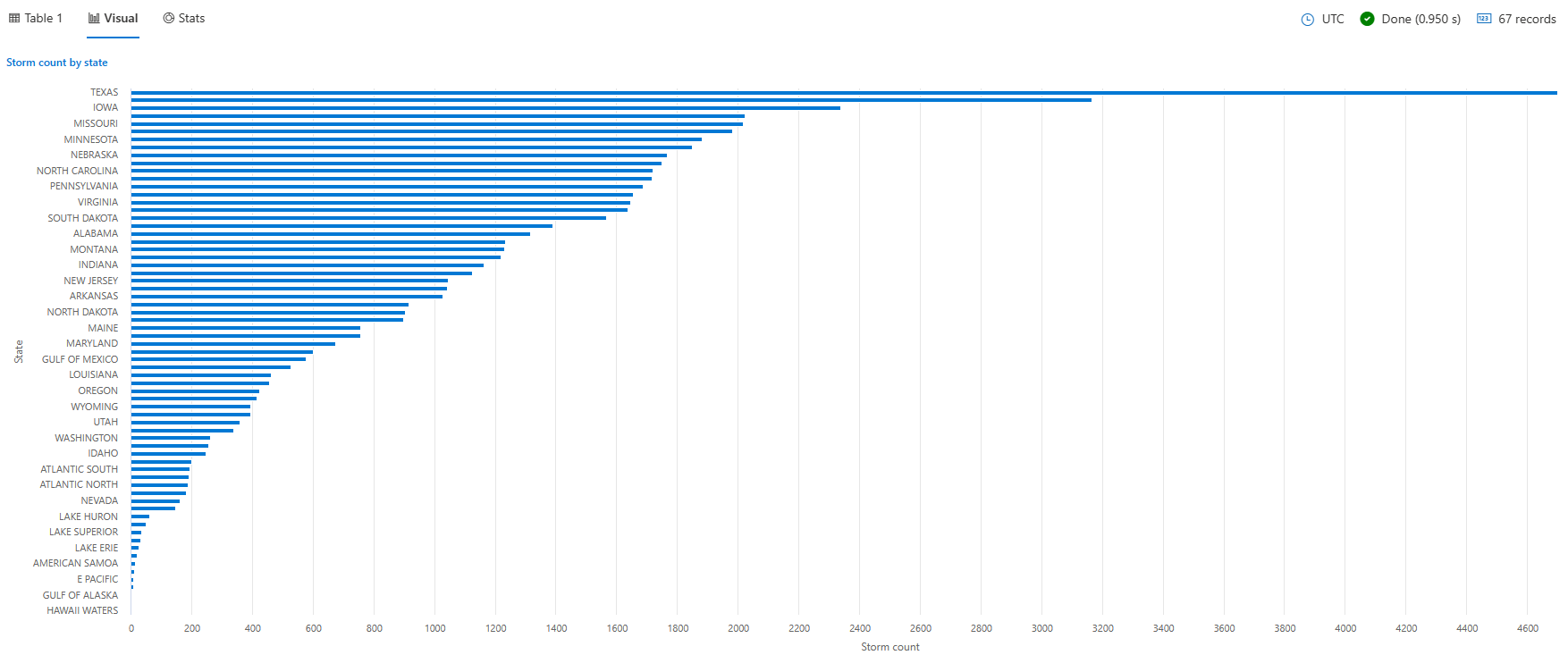
The following query creates a bar chart displaying the number of storm events for each state, filtering only those states with more than 10 events. The chart provides a visual representation of the event distribution across different states.
StormEvents
| summarize event_count=count() by State
| project State, event_count
| render barchart
    with (
    title="Storm count by state",
    ytitle="Storm count",
    xtitle="State",
    legend=hidden
    )
Render a stacked bar chart
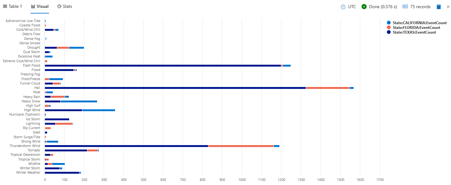
The following query creates a stacked bar chart that shows the total count of storm events by their type for selected states of Texas, California, and Florida. Each bar represents a storm event type, and the stacked bars show the breakdown of storm events by state within each type.
StormEvents
| where State in ("TEXAS", "CALIFORNIA", "FLORIDA")
| summarize EventCount = count() by EventType, State
| order by EventType asc, State desc
| render barchart with (kind=stacked)
Render a stacked100 bar chart
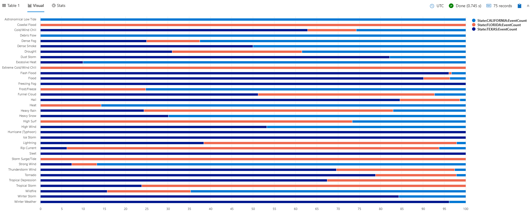
The following query creates a stacked100 bar chart that shows the total count of storm events by their type for selected states of Texas, California, and Florida. The chart shows the distribution of storm events across states within each type. Although the stacks visually sum up to 100, the values actually represent the number of events, not percentages. This visualization is helpful for understanding both the percentages and the actual event counts.
StormEvents
| where State in ("TEXAS", "CALIFORNIA", "FLORIDA")
| summarize EventCount = count() by EventType, State
| order by EventType asc, State desc
| render barchart with (kind=stacked100)
Use the ysplit property
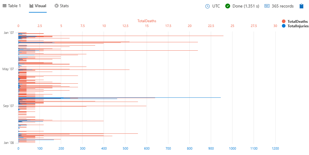
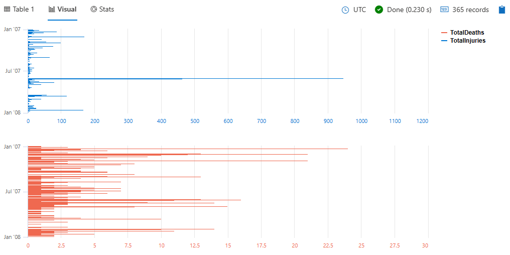
The following query provides a daily summary of storm-related injuries and deaths, visualized as a bar chart with split axes/panels for better comparison.
StormEvents
| summarize
    TotalInjuries = sum(InjuriesDirect) + sum(InjuriesIndirect),
    TotalDeaths = sum(DeathsDirect) + sum(DeathsIndirect)
    by bin(StartTime, 1d)
| project StartTime, TotalInjuries, TotalDeaths
| render barchart with (ysplit=axes)
To split the view into separate panels, specify panels instead of axes:
StormEvents
| summarize
    TotalInjuries = sum(InjuriesDirect) + sum(InjuriesIndirect),
    TotalDeaths = sum(DeathsDirect) + sum(DeathsIndirect)
    by bin(StartTime, 1d)
| project StartTime, TotalInjuries, TotalDeaths
| render barchart with (ysplit=panels)
4 - Card visualization
The card visual only shows one element. If there are multiple columns and rows in the output, the first result record is treated as set of scalar values and shows as a card.
Syntax
T | render card [with (propertyName = propertyValue [, …])]
Parameters
| Name | Type | Required | Description |
|---|---|---|---|
| T | string | ✔️ | Input table name. |
| propertyName, propertyValue | string | A comma-separated list of key-value property pairs. See supported properties. |
Supported properties
All properties are optional.
| PropertyName | PropertyValue |
|---|---|
title | The title of the visualization (of type string). |
Example
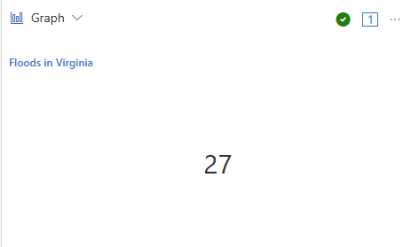
This query provides a count of flood events in Virginia and displays the result in a card format.
StormEvents
| where State=="VIRGINIA" and EventType=="Flood"
| count
| render card with (title="Floods in Virginia")
5 - Column chart visualization
The column chart visual needs a minimum of two columns in the query result. By default, the first column is used as the x-axis. This column can contain text, datetime, or numeric data types. The other columns are used as the y-axis and contain numeric data types to be displayed as vertical lines. Column charts are used for comparing specific sub category items in a main category range, where the length of each line represents its value.
Syntax
T | render columnchart [with (propertyName = propertyValue [, …])]
Parameters
| Name | Type | Required | Description |
|---|---|---|---|
| T | string | ✔️ | Input table name. |
| propertyName, propertyValue | string | A comma-separated list of key-value property pairs. See supported properties. |
Supported properties
All properties are optional.
| PropertyName | PropertyValue |
|---|---|
accumulate | Whether the value of each measure gets added to all its predecessors. (true or false) |
kind | Further elaboration of the visualization kind. For more information, see kind property. |
legend | Whether to display a legend or not (visible or hidden). |
series | Comma-delimited list of columns whose combined per-record values define the series that record belongs to. |
ymin | The minimum value to be displayed on Y-axis. |
ymax | The maximum value to be displayed on Y-axis. |
title | The title of the visualization (of type string). |
xaxis | How to scale the x-axis (linear or log). |
xcolumn | Which column in the result is used for the x-axis. |
xtitle | The title of the x-axis (of type string). |
yaxis | How to scale the y-axis (linear or log). |
ycolumns | Comma-delimited list of columns that consist of the values provided per value of the x column. |
ytitle | The title of the y-axis (of type string). |
ysplit | How to split the visualization into multiple y-axis values. For more information, see ysplit property. |
ysplit property
This visualization supports splitting into multiple y-axis values:
ysplit | Description |
|---|---|
none | A single y-axis is displayed for all series data. This is the default. |
axes | A single chart is displayed with multiple y-axes (one per series). |
panels | One chart is rendered for each ycolumn value. Maximum five panels. |
Supported properties
All properties are optional.
| PropertyName | PropertyValue |
|---|---|
kind | Further elaboration of the visualization kind. For more information, see kind property. |
series | Comma-delimited list of columns whose combined per-record values define the series that record belongs to. |
title | The title of the visualization (of type string). |
kind property
This visualization can be further elaborated by providing the kind property.
The supported values of this property are:
kind value | Definition |
|---|---|
default | Each “column” stands on its own. |
unstacked | Same as default. |
stacked | Stack “columns” one atop the other. |
stacked100 | Stack “columns” and stretch each one to the same height as the others. |
Examples
The example in this section shows how to use the syntax to help you get started.
Render a column chart
This query provides a visual representation of states with a high frequency of storm events, specifically those with more than 10 events, using a column chart.
StormEvents
| summarize event_count=count() by State
| where event_count > 10
| project State, event_count
| render columnchart

Use the ysplit property
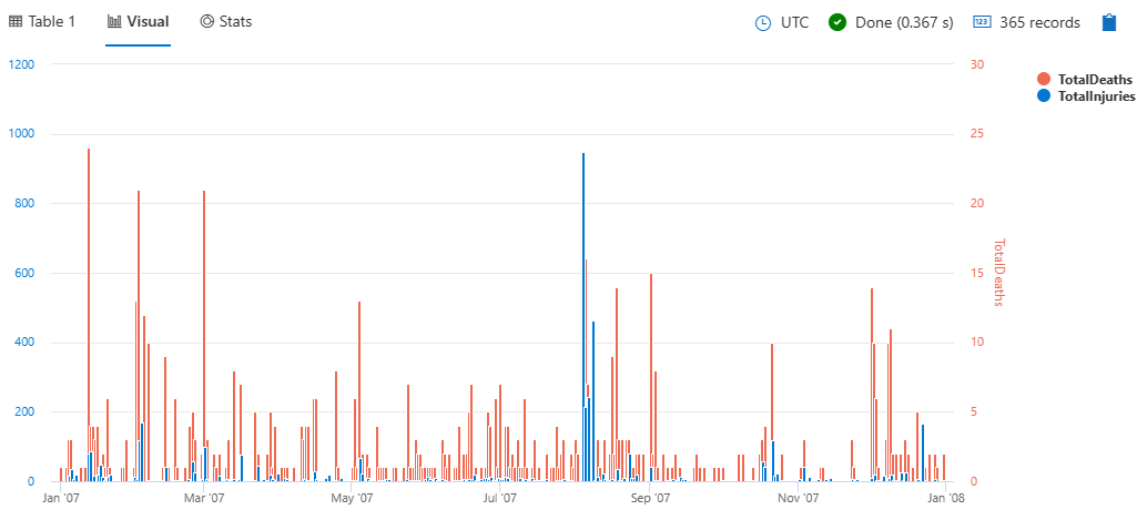
This query provides a daily summary of storm-related injuries and deaths, visualized as a column chart with split axes/panels for better comparison.
StormEvents
| summarize
    TotalInjuries = sum(InjuriesDirect) + sum(InjuriesIndirect),
    TotalDeaths = sum(DeathsDirect) + sum(DeathsIndirect)
    by bin(StartTime, 1d)
| project StartTime, TotalInjuries, TotalDeaths
| render columnchart with (ysplit=axes)
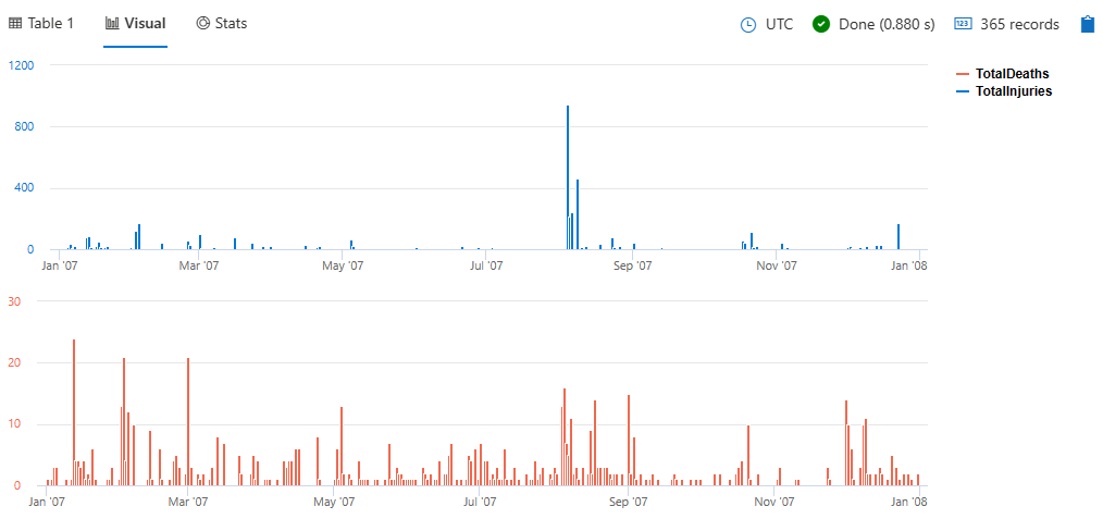
To split the view into separate panels, specify panels instead of axes:
StormEvents
| summarize
    TotalInjuries = sum(InjuriesDirect) + sum(InjuriesIndirect),
    TotalDeaths = sum(DeathsDirect) + sum(DeathsIndirect)
    by bin(StartTime, 1d)
| project StartTime, TotalInjuries, TotalDeaths
| render columnchart with (ysplit=panels)
Example
This query helps you identify states with a significant number of storm events and presents the information in a clear, visual format.
StormEvents
| summarize event_count=count() by State
| where event_count > 10
| project State, event_count
| render columnchart

6 - Ladder chart visualization
The last two columns are the x-axis, and the other columns are the y-axis.
Syntax
T | render ladderchart [with (propertyName = propertyValue [, …])]
Parameters
| Name | Type | Required | Description |
|---|---|---|---|
| T | string | ✔️ | Input table name |
| propertyName, propertyValue | string | A comma-separated list of key-value property pairs. See supported properties. |
Supported properties
All properties are optional.
| PropertyName | PropertyValue |
|---|---|
accumulate | Whether the value of each measure gets added to all its predecessors. (true or false) |
legend | Whether to display a legend or not (visible or hidden). |
series | Comma-delimited list of columns whose combined per-record values define the series that record belongs to. |
ymin | The minimum value to be displayed on Y-axis. |
ymax | The maximum value to be displayed on Y-axis. |
title | The title of the visualization (of type string). |
xaxis | How to scale the x-axis (linear or log). |
xcolumn | Which column in the result is used for the x-axis. |
xtitle | The title of the x-axis (of type string). |
yaxis | How to scale the y-axis (linear or log). |
ycolumns | Comma-delimited list of columns that consist of the values provided per value of the x column. |
ytitle | The title of the y-axis (of type string). |
Examples
The example in this section shows how to use the syntax to help you get started.
The examples in this article use publicly available tables in the help cluster, such as the StormEvents table in the Samples database.
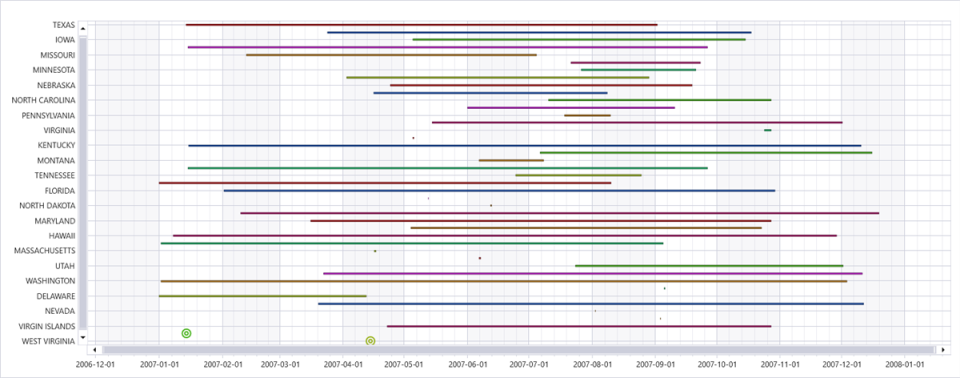
Dates of storms by state
This query outputs a state-wise visualization of the duration of rain-related storm events, displayed as a ladder chart to help you analyze the temporal distribution of these events.
StormEvents
| where EventType  has "rain"
| summarize min(StartTime), max(EndTime) by State
| render ladderchart
Dates of storms by event type
This query outputs a visualization of the duration of various storm events in Washington, displayed as a ladder chart to help you analyze the temporal distribution of these events by type.
StormEvents
| where State == "WASHINGTON"
| summarize min(StartTime), max(EndTime) by EventType
| render ladderchart

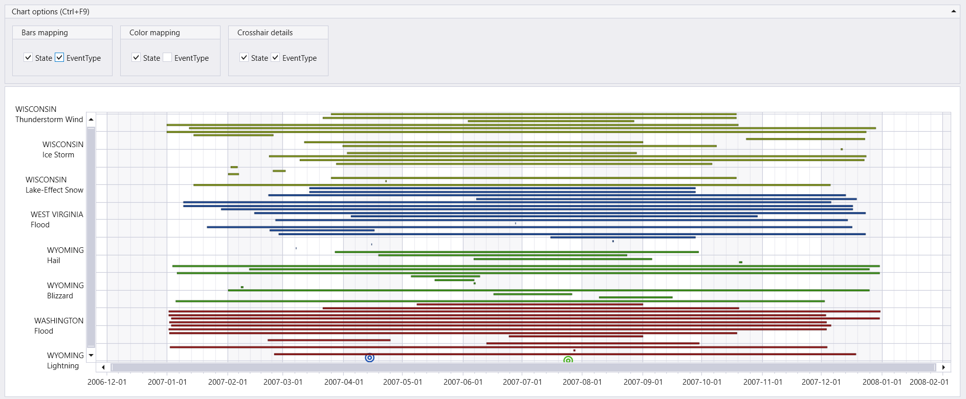
Dates of storms by state and event type
This query outputs a visualization of the duration of various storm events in states starting with “W”, displayed as a ladder chart to help you analyze the temporal distribution of these events by state and event type.
StormEvents
| where State startswith "W"
| summarize min(StartTime), max(EndTime) by State, EventType
| render ladderchart with (series=State, EventType)
7 - Line chart visualization
The line chart visual is the most basic type of chart. The first column of the query should be numeric and is used as the x-axis. Other numeric columns are the y-axes. Line charts track changes over short and long periods of time. When smaller changes exist, line graphs are more useful than bar graphs.
Syntax
T | render linechart [with ( propertyName = propertyValue [, …] )]
Parameters
| Name | Type | Required | Description |
|---|---|---|---|
| T | string | ✔️ | Input table name. |
| propertyName, propertyValue | string | A comma-separated list of key-value property pairs. See supported properties. |
Supported properties
All properties are optional.
| PropertyName | PropertyValue |
|---|---|
accumulate | Whether the value of each measure gets added to all its predecessors (true or false). |
legend | Whether to display a legend or not (visible or hidden). |
series | Comma-delimited list of columns whose combined per-record values define the series that record belongs to. |
ymin | The minimum value to be displayed on Y-axis. |
ymax | The maximum value to be displayed on Y-axis. |
title | The title of the visualization (of type string). |
xaxis | How to scale the x-axis (linear or log). |
xcolumn | Which column in the result is used for the x-axis. |
xtitle | The title of the x-axis (of type string). |
yaxis | How to scale the y-axis (linear or log). |
ycolumns | Comma-delimited list of columns that consist of the values provided per value of the x column. |
ysplit | How to split the visualization into multiple y-axis values. For more information, see ysplit property. |
ytitle | The title of the y-axis (of type string). |
ysplit property
This visualization supports splitting into multiple y-axis values:
ysplit | Description |
|---|---|
none | A single y-axis is displayed for all series data. (Default) |
axes | A single chart is displayed with multiple y-axes (one per series). |
panels | One chart is rendered for each ycolumn value. Maximum five panels. |
Examples
The example in this section shows how to use the syntax to help you get started.
Render a line chart
This query retrieves storm events in Virginia, focusing on the start time and property damage, and then displays this information in a line chart.
StormEvents
| where State=="VIRGINIA"
| project StartTime, DamageProperty
| render linechart

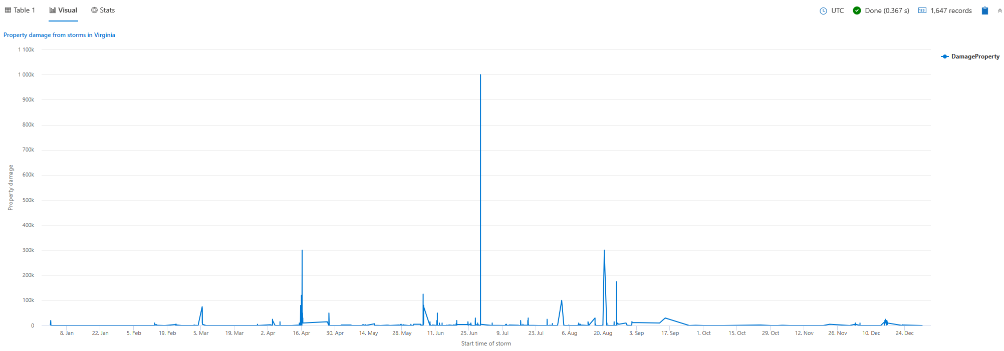
Label a line chart
This query retrieves storm events in Virginia, focusing on the start time and property damage, and then displays this information in a line chart with specified titles for better clarity and presentation.
StormEvents
| where State=="VIRGINIA"
| project StartTime, DamageProperty
| render linechart
    with (
    title="Property damage from storms in Virginia",
    xtitle="Start time of storm",
    ytitle="Property damage"
    )
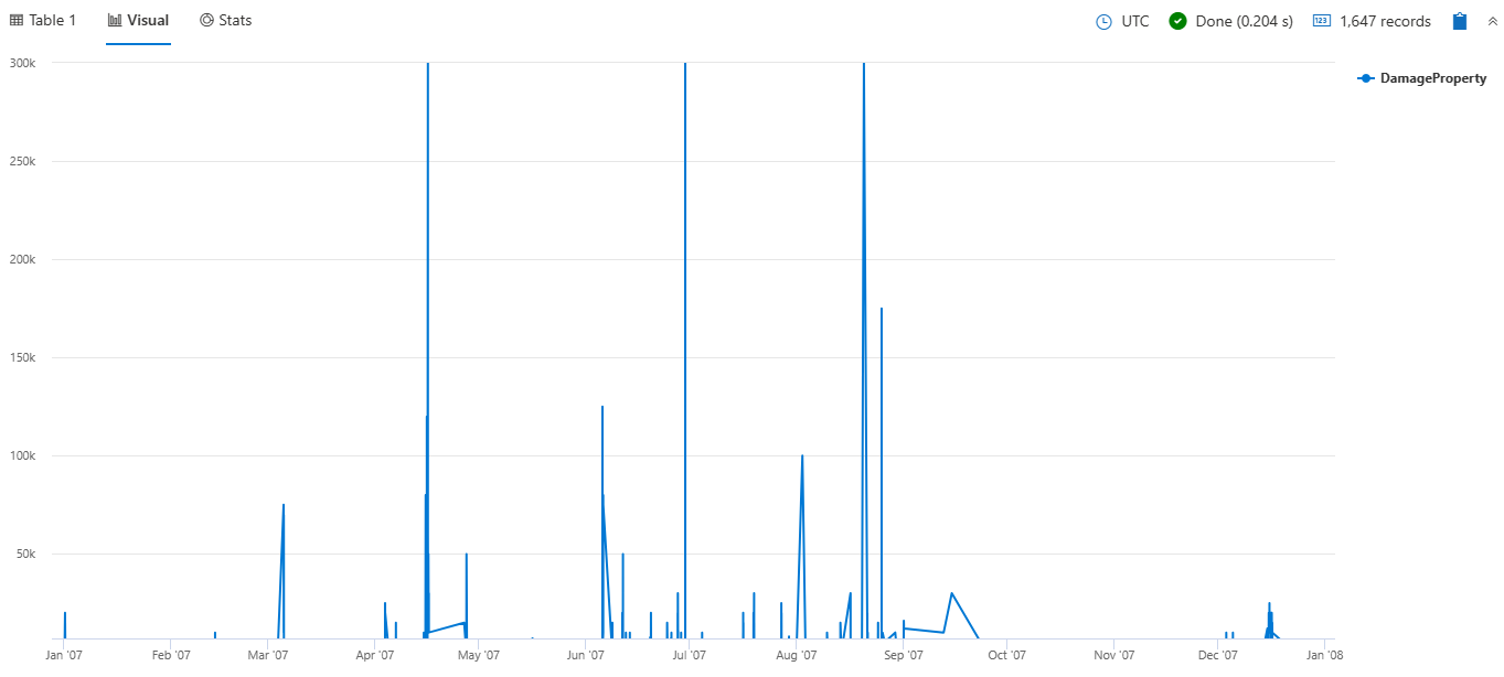
Limit values displayed on the y-axis
This query retrieves storm events in Virginia, focusing on the start time and property damage, and then displays this information in a line chart with specified y-axis limits for better visualization of the data.
StormEvents
| where State=="VIRGINIA"
| project StartTime, DamageProperty
| render linechart with (ymin=7000, ymax=300000)
View multiple y-axes
This query retrieves hail events in Texas, Nebraska, and Kansas. It counts the number of hail events per day for each state, and then displays this information in a line chart with separate panels for each state.
StormEvents
| where State in ("TEXAS", "NEBRASKA", "KANSAS") and EventType == "Hail"
| summarize count() by State, bin(StartTime, 1d)
| render linechart with (ysplit=panels)

Related content
8 - Pie chart visualization
The pie chart visual needs a minimum of two columns in the query result. By default, the first column is used as the color axis. This column can contain text, datetime, or numeric data types. Other columns will be used to determine the size of each slice and contain numeric data types. Pie charts are used for presenting a composition of categories and their proportions out of a total.
The pie chart visual can also be used in the context of Geospatial visualizations.
Syntax
T | render piechart [with (propertyName = propertyValue [, …])]
Parameters
| Name | Type | Required | Description |
|---|---|---|---|
| T | string | ✔️ | Input table name. |
| propertyName, propertyValue | string | A comma-separated list of key-value property pairs. See supported properties. |
Supported properties
All properties are optional.
| PropertyName | PropertyValue |
|---|---|
accumulate | Whether the value of each measure gets added to all its predecessors. (true or false) |
kind | Further elaboration of the visualization kind. For more information, see kind property. |
legend | Whether to display a legend or not (visible or hidden). |
series | Comma-delimited list of columns whose combined per-record values define the series that record belongs to. |
title | The title of the visualization (of type string). |
xaxis | How to scale the x-axis (linear or log). |
xcolumn | Which column in the result is used for the x-axis. |
xtitle | The title of the x-axis (of type string). |
yaxis | How to scale the y-axis (linear or log). |
ycolumns | Comma-delimited list of columns that consist of the values provided per value of the x column. |
ytitle | The title of the y-axis (of type string). |
| PropertyName | PropertyValue |
|---|---|
kind | Further elaboration of the visualization kind. For more information, see kind property. |
series | Comma-delimited list of columns whose combined per-record values define the series that record belongs to. |
title | The title of the visualization (of type string). |
kind property
This visualization can be further elaborated by providing the kind property.
The supported values of this property are:
kind value | Description |
|---|---|
map | Expected columns are [Longitude, Latitude] or GeoJSON point, color-axis and numeric. Supported in Kusto Explorer desktop. For more information, see Geospatial visualizations |
Example
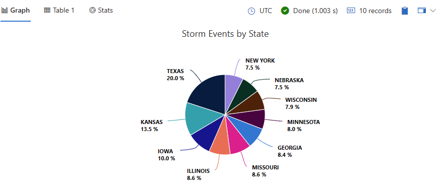
This query provides a visual representation of the top 10 states with the highest number of storm events, displayed as a pie chart
StormEvents
| summarize statecount=count() by State
| sort by statecount
| limit 10
| render piechart with(title="Storm Events by State")
9 - Pivot chart visualization
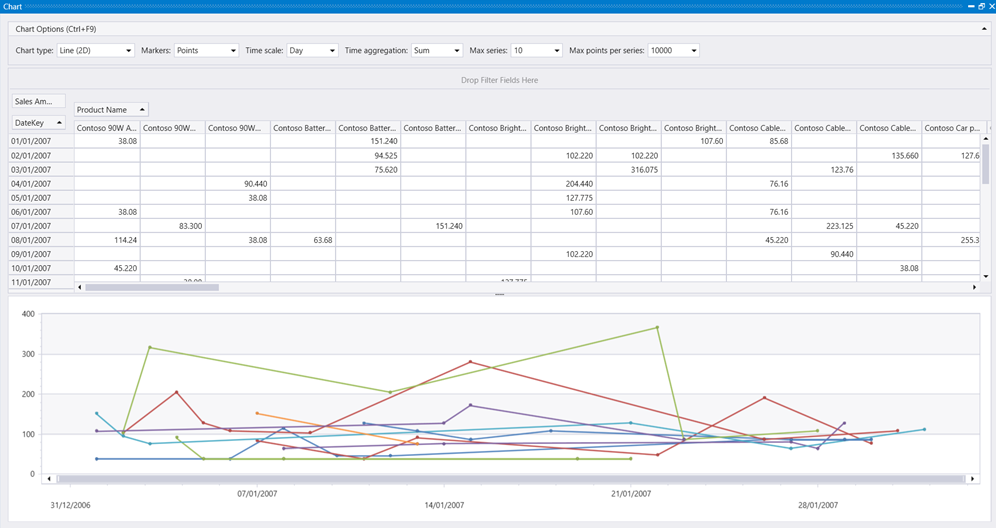
Displays a pivot table and chart. You can interactively select data, columns, rows, and various chart types.
Syntax
T | render pivotchart
Parameters
| Name | Type | Required | Description |
|---|---|---|---|
| T | string | ✔️ | Input table name. |
Example
This query provides a detailed analysis of sales for Contoso computer products within the specified date range, visualized as a pivot chart.
SalesFact
| join kind= inner Products on ProductKey
| where ProductCategoryName has "Computers" and ProductName has "Contoso"
| where DateKey between (datetime(2006-12-31) .. datetime(2007-02-01))
| project SalesAmount, ProductName, DateKey
| render pivotchart
Output
10 - Plotly visualization
The Plotly graphics library supports ~80 chart types that are useful for advanced charting including geographic, scientific, machine learning, 3d, animation, and many other chart types. For more information, see Plotly.
To render a Plotly visual in Kusto Query Language, the query must generate a table with a single string cell containing Plotly JSON. This Plotly JSON string can be generated by one of the following two methods:
Write your own Plotly visualization in Python
In this method, you dynamically create the Plotly JSON string in Python using the Plotly package. This process requires use of the python() plugin. The Python script is run on the existing nodes using the inline python() plugin. It generates a Plotly JSON that is rendered by the client application.
All types of Plotly visualizations are supported.
Example
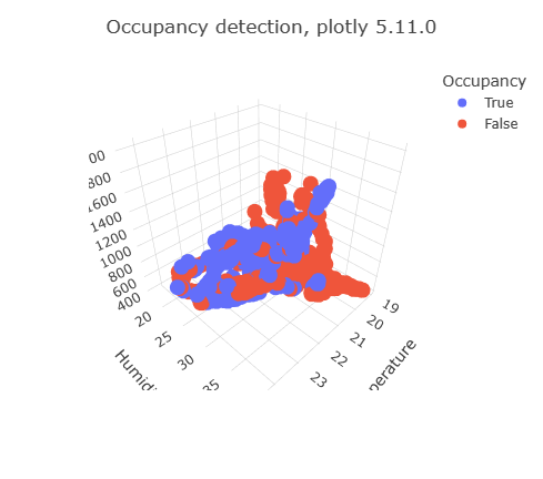
The following query uses inline Python to create a 3D scatter chart:
OccupancyDetection
| project Temperature, Humidity, CO2, Occupancy
| where rand() < 0.1
| evaluate python(typeof(plotly:string),
```if 1:
    import plotly.express as px
    fig = px.scatter_3d(df, x='Temperature', y='Humidity', z='CO2', color='Occupancy')
    fig.update_layout(title=dict(text="Occupancy detection, plotly 5.11.0"))
    plotly_obj = fig.to_json()
    result = pd.DataFrame(data = [plotly_obj], columns = ["plotly"])
```)
The Plotly graphics library supports ~80 chart types including basic charts, scientific, statistical, financial, maps, 3D, animations, and more. To render a Plotly visual in KQL, the query must generate a table with a single string cell containing Plotly JSON.
Since python isn’t available in this service, you create this Plotly JSON using a preprepared template.
Use a preprepared Plotly template
In this method, a preprepared Plotly JSON for specific visualization can be reused by replacing the data objects with the required data to be rendered. The templates can be stored in a standard table, and the data replacement logic can be packed in a stored function.
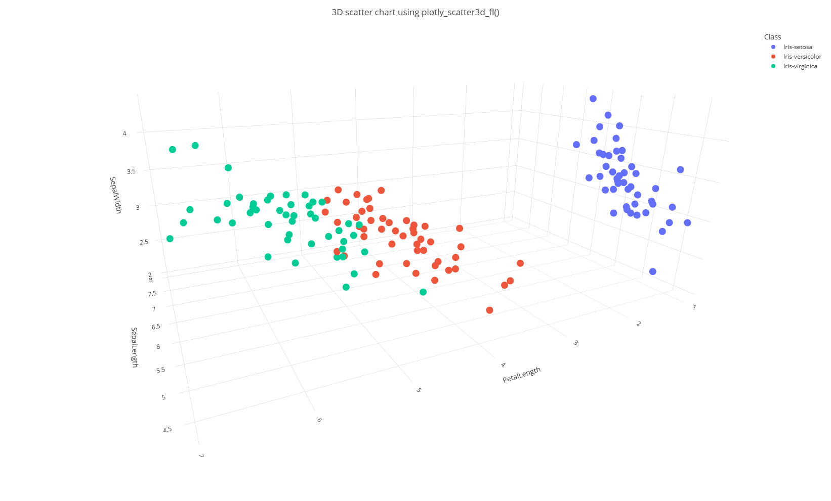
Currently, the supported templates are: plotly_anomaly_fl() and plotly_scatter3d_fl(). Refer to these documents for syntax and usage.
Example
let plotly_scatter3d_fl=(tbl:(*), x_col:string, y_col:string, z_col:string, aggr_col:string='', chart_title:string='3D Scatter chart')
{
    let scatter3d_chart = toscalar(PlotlyTemplate | where name == "scatter3d" | project plotly);
    let tbl_ex = tbl | extend _x = column_ifexists(x_col, 0.0), _y = column_ifexists(y_col, 0.0), _z = column_ifexists(z_col, 0.0), _aggr = column_ifexists(aggr_col, 'ALL');
    tbl_ex
    | serialize
    | summarize _x=pack_array(make_list(_x)), _y=pack_array(make_list(_y)), _z=pack_array(make_list(_z)) by _aggr
    | summarize _aggr=make_list(_aggr), _x=make_list(_x), _y=make_list(_y), _z=make_list(_z)
    | extend plotly = scatter3d_chart
    | extend plotly=replace_string(plotly, '$CLASS1$', tostring(_aggr[0]))
    | extend plotly=replace_string(plotly, '$CLASS2$', tostring(_aggr[1]))
    | extend plotly=replace_string(plotly, '$CLASS3$', tostring(_aggr[2]))
    | extend plotly=replace_string(plotly, '$X_NAME$', x_col)
    | extend plotly=replace_string(plotly, '$Y_NAME$', y_col)
    | extend plotly=replace_string(plotly, '$Z_NAME$', z_col)
    | extend plotly=replace_string(plotly, '$CLASS1_X$', tostring(_x[0]))
    | extend plotly=replace_string(plotly, '$CLASS1_Y$', tostring(_y[0]))
    | extend plotly=replace_string(plotly, '$CLASS1_Z$', tostring(_z[0]))
    | extend plotly=replace_string(plotly, '$CLASS2_X$', tostring(_x[1]))
    | extend plotly=replace_string(plotly, '$CLASS2_Y$', tostring(_y[1]))
    | extend plotly=replace_string(plotly, '$CLASS2_Z$', tostring(_z[1]))
    | extend plotly=replace_string(plotly, '$CLASS3_X$', tostring(_x[2]))
    | extend plotly=replace_string(plotly, '$CLASS3_Y$', tostring(_y[2]))
    | extend plotly=replace_string(plotly, '$CLASS3_Z$', tostring(_z[2]))
    | extend plotly=replace_string(plotly, '$TITLE$', chart_title)
    | project plotly
};
Iris
| invoke plotly_scatter3d_fl(x_col='SepalLength', y_col='PetalLength', z_col='SepalWidth', aggr_col='Class', chart_title='3D scatter chart using plotly_scatter3d_fl()')
| render plotly
Related content
11 - Scatter chart visualization
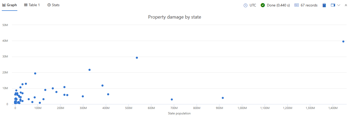
In a scatter chart visual, the first column is the x-axis and should be a numeric column. Other numeric columns are y-axes. Scatter plots are used to observe relationships between variables. The scatter chart visual can also be used in the context of Geospatial visualizations.
Syntax
T | render scatterchart [with (propertyName = propertyValue [, …])]
Parameters
| Name | Type | Required | Description |
|---|---|---|---|
| T | string | ✔️ | Input table name. |
| propertyName, propertyValue | string | A comma-separated list of key-value property pairs. See supported properties. |
Supported properties
All properties are optional.
| PropertyName | PropertyValue |
|---|---|
accumulate | Whether the value of each measure gets added to all its predecessors. (true or false) |
kind | Further elaboration of the visualization kind. For more information, see kind property. |
legend | Whether to display a legend or not (visible or hidden). |
series | Comma-delimited list of columns whose combined per-record values define the series that record belongs to. |
ymin | The minimum value to be displayed on Y-axis. |
ymax | The maximum value to be displayed on Y-axis. |
title | The title of the visualization (of type string). |
xaxis | How to scale the x-axis (linear or log). |
xcolumn | Which column in the result is used for the x-axis. |
xtitle | The title of the x-axis (of type string). |
yaxis | How to scale the y-axis (linear or log). |
ycolumns | Comma-delimited list of columns that consist of the values provided per value of the x column. |
ytitle | The title of the y-axis (of type string). |
| PropertyName | PropertyValue |
|---|---|
kind | Further elaboration of the visualization kind. For more information, see kind property. |
series | Comma-delimited list of columns whose combined per-record values define the series that record belongs to. |
title | The title of the visualization (of type string). |
kind property
This visualization can be further elaborated by providing the kind property.
The supported values of this property are:
kind value | Description |
|---|---|
map | Expected columns are [Longitude, Latitude] or GeoJSON point. Series column is optional. For more information, see Geospatial visualizations. |
Example
This query provides a scatter chart that helps you analyze the correlation between state populations and the total property damage caused by storm events.
StormEvents
| summarize sum(DamageProperty)by State
| lookup PopulationData on State
| project-away State
| render scatterchart with (xtitle="State population", title="Property damage by state", legend=hidden)
12 - Stacked area chart visualization
The stacked area chart visual shows a continuous relationship. This visual is similar to the Area chart, but shows the area under each element of a series. The first column of the query should be numeric and is used as the x-axis. Other numeric columns are the y-axes. Unlike line charts, area charts also visually represent volume. Area charts are ideal for indicating the change among different datasets.
Syntax
T | render stackedareachart [with (propertyName = propertyValue [, …])]
Supported parameters
| Name | Type | Required | Description |
|---|---|---|---|
| T | string | ✔️ | Input table name. |
| propertyName, propertyValue | string | A comma-separated list of key-value property pairs. See supported properties. |
Supported properties
All properties are optional.
| PropertyName | PropertyValue |
|---|---|
accumulate | Whether the value of each measure gets added to all its predecessors. (true or false) |
legend | Whether to display a legend or not (visible or hidden). |
series | Comma-delimited list of columns whose combined per-record values define the series that record belongs to. |
ymin | The minimum value to be displayed on Y-axis. |
ymax | The maximum value to be displayed on Y-axis. |
title | The title of the visualization (of type string). |
xaxis | How to scale the x-axis (linear or log). |
xcolumn | Which column in the result is used for the x-axis. |
xtitle | The title of the x-axis (of type string). |
yaxis | How to scale the y-axis (linear or log). |
ycolumns | Comma-delimited list of columns that consist of the values provided per value of the x column. |
ytitle | The title of the y-axis (of type string). |
Example
The following query summarizes data from the nyc_taxi table by number of passengers and visualizes the data in a stacked area chart. The x-axis shows the pickup time in two day intervals, and the stacked areas represent different passenger counts.
nyc_taxi
| summarize count() by passenger_count, bin(pickup_datetime, 2d)
| render stackedareachart with (xcolumn=pickup_datetime, series=passenger_count)
Output

Related content
13 - Table visualization
Default - results are shown as a table.
Syntax
T | render table [with (propertyName = propertyValue [, …])]
Parameters
| Name | Type | Required | Description |
|---|---|---|---|
| T | string | ✔️ | Input table name. |
| propertyName, propertyValue | string | A comma-separated list of key-value property pairs. See supported properties. |
Supported properties
All properties are optional.
| PropertyName | PropertyValue |
|---|---|
accumulate | Whether the value of each measure gets added to all its predecessors. (true or false) |
legend | Whether to display a legend or not (visible or hidden). |
series | Comma-delimited list of columns whose combined per-record values define the series that record belongs to. |
ymin | The minimum value to be displayed on Y-axis. |
ymax | The maximum value to be displayed on Y-axis. |
title | The title of the visualization (of type string). |
xaxis | How to scale the x-axis (linear or log). |
xcolumn | Which column in the result is used for the x-axis. |
xtitle | The title of the x-axis (of type string). |
yaxis | How to scale the y-axis (linear or log). |
ycolumns | Comma-delimited list of columns that consist of the values provided per value of the x column. |
ytitle | The title of the y-axis (of type string). |
| PropertyName | PropertyValue |
|---|---|
series | Comma-delimited list of columns whose combined per-record values define the series that record belongs to. |
title | The title of the visualization (of type string). |
Example
This query outputs a snapshot of the first 10 storm event records, displayed in a table format.
StormEvents
| take 10
| render table

14 - Time chart visualization
A time chart visual is a type of line graph. The first column of the query is the x-axis, and should be a datetime. Other numeric columns are y-axes. One string column values are used to group the numeric columns and create different lines in the chart. Other string columns are ignored. The time chart visual is like a line chart except the x-axis is always time.
Syntax
T | render timechart [with (propertyName = propertyValue [, …])]
Parameters
| Name | Type | Required | Description |
|---|---|---|---|
| T | string | ✔️ | Input table name. |
| propertyName, propertyValue | string | A comma-separated list of key-value property pairs. See supported properties. |
Supported properties
All properties are optional.
| PropertyName | PropertyValue |
|---|---|
accumulate | Whether the value of each measure gets added to all its predecessors (true or false). |
legend | Whether to display a legend or not (visible or hidden). |
series | Comma-delimited list of columns whose combined per-record values define the series that record belongs to. |
ymin | The minimum value to be displayed on Y-axis. |
ymax | The maximum value to be displayed on Y-axis. |
title | The title of the visualization (of type string). |
xaxis | How to scale the x-axis (linear or log). |
xcolumn | Which column in the result is used for the x-axis. |
xtitle | The title of the x-axis (of type string). |
yaxis | How to scale the y-axis (linear or log). |
ycolumns | Comma-delimited list of columns that consist of the values provided per value of the x column. |
ysplit | How to split the visualization into multiple y-axis values. For more information, see ysplit property. |
ytitle | The title of the y-axis (of type string). |
ysplit property
This visualization supports splitting into multiple y-axis values:
ysplit | Description |
|---|---|
none | A single y-axis is displayed for all series data. (Default) |
axes | A single chart is displayed with multiple y-axes (one per series). |
panels | One chart is rendered for each ycolumn value. Maximum five panels. |
Examples
The example in this section shows how to use the syntax to help you get started.
Render a timechart
The following example renders a timechart with a title “Web app. traffic over a month, decomposing” that decomposes the data into baseline, seasonal, trend, and residual components.
let min_t = datetime(2017-01-05);
let max_t = datetime(2017-02-03 22:00);
let dt = 2h;
demo_make_series2
| make-series num=avg(num) on TimeStamp from min_t to max_t step dt by sid
| where sid == 'TS1'   //  select a single time series for a cleaner visualization
| extend (baseline, seasonal, trend, residual) = series_decompose(num, -1, 'linefit')  //  decomposition of a set of time series to seasonal, trend, residual, and baseline (seasonal+trend)
| render timechart with(title='Web app. traffic over a month, decomposition')

Label a timechart
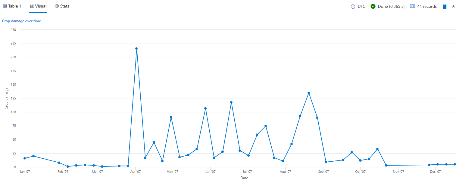
The following example renders a timechart that depicts crop damage grouped by week. The timechart x axis label is “Date” and the y axis label is “Crop damage.”
StormEvents
| where StartTime between (datetime(2007-01-01) .. datetime(2007-12-31))
    and DamageCrops > 0
| summarize EventCount = count() by bin(StartTime, 7d)
| render timechart
    with (
    title="Crop damage over time",
    xtitle="Date",
    ytitle="Crop damage",
    legend=hidden
    )
View multiple y-axes
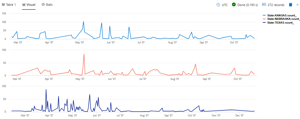
The following example renders daily hail events in the states of Texas, Nebraska, and Kansas. The visualization uses the ysplit property to render each state’s events in separate panels for comparison.
StormEvents
| where State in ("TEXAS", "NEBRASKA", "KANSAS") and EventType == "Hail"
| summarize count() by State, bin(StartTime, 1d)
| render timechart with (ysplit=panels)
Related content
Supported properties
All properties are optional.
| PropertyName | PropertyValue |
|---|---|
series | Comma-delimited list of columns whose combined per-record values define the series that record belongs to. |
title | The title of the visualization (of type string). |
Example
The following example renders a timechart with a title “Web app. traffic over a month, decomposing” that decomposes the data into baseline, seasonal, trend, and residual components.
let min_t = datetime(2017-01-05);
let max_t = datetime(2017-02-03 22:00);
let dt = 2h;
demo_make_series2
| make-series num=avg(num) on TimeStamp from min_t to max_t step dt by sid
| where sid == 'TS1'   //  select a single time series for a cleaner visualization
| extend (baseline, seasonal, trend, residual) = series_decompose(num, -1, 'linefit')  //  decomposition of a set of time series to seasonal, trend, residual, and baseline (seasonal+trend)
| render timechart with(title='Web app. traffic of a month, decomposition')

15 - Time pivot visualization
The time pivot visualization is an interactive navigation over the events time-line pivoting on time axis.
Syntax
T | render timepivot [with (propertyName = propertyValue [, …])]
Parameters
| Name | Type | Required | Description |
|---|---|---|---|
| T | string | ✔️ | Input table name. |
| propertyName, propertyValue | string | A comma-separated list of key-value property pairs. See supported properties. |
Supported properties
All properties are optional.
| PropertyName | PropertyValue |
|---|---|
series | Comma-delimited list of columns whose combined per-record values define the series that record belongs to. |
Interactive display
After you render the time pivot, you can further investigate and interact with the data by adding slice levels, and by drilling into specific time slices. The data in the table updates interactively according to the slice options you configure. The slice options that are available are:
- Change, add, and remove multiple slice levels
- Expand rows to view details of each level
- Toggle to view by start time or by end time
- Select specific rows, or specific time slices, and view their data in the table.
Examples
The examples in this section show how to use the syntax to help you get started.
Visualize flood events per state
This query outputs a visualization of flood events in the specified Midwestern states, displayed as a time pivot chart.
let midwesternStates = dynamic([
  "ILLINOIS", "INDIANA", "IOWA", "KANSAS", "MICHIGAN", "MINNESOTA",
  "MISSOURI", "NEBRASKA", "NORTH DAKOTA", "OHIO", "SOUTH DAKOTA", "WISCONSIN"
]);
StormEvents
| where EventType == "Flood" and State in (midwesternStates)
| render timepivot with (series=State)
Output
:::image type=“content” source=“media/visualization-timepivot/time-pivot-visualization.jpg” lightbox=“media/visualization-timepivot/time-pivot-visualization.jpg” alt-text=“Screenshot of time pivot in Kusto.Explorer.”:::
You can further interact with the time pivot, for example:
Select a new slice option to change the data displayed in the time pivot. The data in the table below the time pivot updates to reflect the new series.
:::image type=“content” source=“media/visualization-timepivot/time-pivot-slice-options.png” lightbox=“media/visualization-timepivot/time-pivot-slice-options.png” alt-text=“Screenshot of time pivot slice options in Kusto.Explorer.”:::
Add slice option levels to further investigate and interact with the data. Expand each row to see the levels added.
:::image type=“content” source=“media/visualization-timepivot/time-pivot-add-levels.png” lightbox=“media/visualization-timepivot/time-pivot-add-levels.png” alt-text=“Screenshot of time pivot with multiple levels expanded in Kusto.Explorer.”:::
To display the data relevant for a specific slice, select one or more time slices in a row of the time pivot.
:::image type=“content” source=“media/visualization-timepivot/time-pivot-slice-specific.png” lightbox=“media/visualization-timepivot/time-pivot-slice-specific.png” alt-text=“Screenshot of specific time slicein Kusto.Explorer.”:::
View and slice hierarchical OpenTelemetry data
OpenTelemetry data slice options reflect its nested hierarchy.
In this example, a time pivot is rendered according to a specific TraceID in the datatable. The query shown in this example contains the first two rows of data from a large table.
datatable(TraceID:string, SpanID:string, ParentID:string, SpanName:string, SpanStatus:string, SpanKind:string, StartTime:datetime, EndTime:datetime, ResourceAttributes:dynamic, TraceAttributes:dynamic, Events:dynamic, Links:dynamic)
[
    "c339bbae48eb8426f9a63c4eee55284c", "d1265cecd4c291ee", "", "POST", "STATUS_CODE_UNSET", "SPAN_KIND_CLIENT", datetime(2025-04-07T04:15:52.1657810Z), datetime(2025-04-07T04:16:01.6616919Z), dynamic({"k8s.namespace.name":"otel-demo","k8s.pod.start_time":"2025-04-06T00:19:47.0000000Z","k8s.deployment.name":"opentelemetry-demo-loadgenerator","k8s.node.name":"aks-userpool-31567306-vmss000003","service.name":"loadgenerator","service.version":"1.12.0","k8s.pod.uid":"d2fbaf5d-b5c2-4dac-af08-b92d56573899","k8s.pod.name":"opentelemetry-demo-loadgenerator-6994f5db8-lq4qs","service.instance.id":"d2fbaf5d-b5c2-4dac-af08-b92d56573899","service.namespace":"opentelemetry-demo","k8s.pod.ip":"10.244.0.57","telemetry.sdk.language":"python","telemetry.sdk.version":"1.25.0","telemetry.sdk.name":"opentelemetry"}), dynamic({"http.status_code":200,"http.url":"http://opentelemetry-demo-frontendproxy:8080/api/checkout","http.method":"POST","scope.name":"opentelemetry.instrumentation.requests","scope.version":"0.46b0"}), dynamic([]), dynamic([]),
    "c339bbae48eb8426f9a63c4eee55284c", "651aa53d2f583eca", "d488b4a32f60794f", "POST /api/checkout", "STATUS_CODE_UNSET", "SPAN_KIND_SERVER", datetime(2025-04-07T04:15:52.1680000Z), datetime(2025-04-07T04:16:01.4667420Z), dynamic({"k8s.namespace.name":"otel-demo","k8s.pod.start_time":"2025-04-06T00:19:47.0000000Z","k8s.deployment.name":"opentelemetry-demo-frontend","k8s.node.name":"aks-userpool-31567306-vmss000003","service.name":"frontend","service.version":"1.12.0","k8s.pod.uid":"b61b8875-b9ec-4144-b866-df88b8c6c67c","k8s.pod.name":"opentelemetry-demo-frontend-59bccd8fdb-j9xxf","service.instance.id":"b61b8875-b9ec-4144-b866-df88b8c6c67c","service.namespace":"opentelemetry-demo","k8s.pod.ip":"10.244.0.45","process.command_args":["/usr/local/bin/node","--require","./Instrumentation.js","/app/server.js"],"os.type":"linux","telemetry.sdk.language":"nodejs","telemetry.sdk.version":"1.25.1","process.pid":16,"telemetry.sdk.name":"opentelemetry","process.runtime.name":"nodejs","process.runtime.description":"Node.js","process.runtime.version":"20.18.0","host.name":"opentelemetry-demo-frontend-59bccd8fdb-j9xxf","host.arch":"amd64","process.executable.path":"/usr/local/bin/node","container.id":"d1763eedd13fa94f9581d9099ab481e112a8fdf95b6da831b9f01a4b8490fe60","os.version":"5.15.176.3-3.cm2","process.owner":"nextjs","process.command":"/app/server.js","process.executable.name":"node"}), dynamic({"http.status_code":200,"http.method":"POST","scope.name":"next.js","scope.version":"0.0.1","http.target":"/api/checkout","next.span_type":"BaseServer.handleRequest","next.span_name":"POST /api/checkout","next.rsc":false}), dynamic([]), dynamic([]),
    ...
]
| where TraceID == '081a007d3b7deaf32ca43a554c5058bd'
| render timepivot
Output
In the time pivot, the Slice options are automatically set to SpanKind as the column to pivot by.
:::image type=“content” source=“media/visualization-timepivot/telemetry-spankind.png” lightbox=“media/visualization-timepivot/telemetry-spankind.png” alt-text=“Screenshot of the time pivot rendered with an OpenTelemetry data source.”:::
You can show the hierarchy of the individual spans in the same OpenTelemetry trace, by changing the Slice options to (SpanID). The hierarchy is expandable to display the spans that make up the entire trace. For each span you can see the span kind, span name, and span ID as the span header.
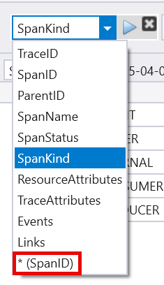
The header in the first line is [SPAN_KIND_CLIENT/POST]: 3275d2b91035ce2e and is expanded to show the hierarchy.
:::image type=“content” source=“media/visualization-timepivot/telemetry-time-pivot.png” lightbox=“media/visualization-timepivot/telemetry-time-pivot.png” alt-text=“Screenshot of the time pivot with expanded heirarchy.”:::
16 - Treemap visualization
Treemaps display hierarchical data as a set of nested rectangles. Each level of the hierarchy is represented by a colored rectangle (branch) containing smaller rectangles (leaves).
Syntax
T | render treemap [with (propertyName = propertyValue [, …])]
Parameters
| Name | Type | Required | Description |
|---|---|---|---|
| T | string | ✔️ | Input table name. |
| propertyName, propertyValue | string | A comma-separated list of key-value property pairs. See supported properties. |
Supported properties
All properties are optional.
| PropertyName | PropertyValue |
|---|---|
series | Comma-delimited list of columns whose combined per-record values define the series that record belongs to. |
Example
This query counts the number of storm events for each type and state, sorts them in descending order, limits the results to the top 30, and then visualizes the data as a treemap.
StormEvents
| summarize StormEvents=count() by EventType, State
| sort by StormEvents
| limit 30
| render treemap with(title="Storm Events by EventType and State")
