Column chart visualization
The column chart visual needs a minimum of two columns in the query result. By default, the first column is used as the x-axis. This column can contain text, datetime, or numeric data types. The other columns are used as the y-axis and contain numeric data types to be displayed as vertical lines. Column charts are used for comparing specific sub category items in a main category range, where the length of each line represents its value.
Syntax
T | render columnchart [with (propertyName = propertyValue [, …])]
Parameters
| Name | Type | Required | Description |
|---|---|---|---|
| T | string | ✔️ | Input table name. |
| propertyName, propertyValue | string | A comma-separated list of key-value property pairs. See supported properties. |
Supported properties
All properties are optional.
| PropertyName | PropertyValue |
|---|---|
accumulate | Whether the value of each measure gets added to all its predecessors. (true or false) |
kind | Further elaboration of the visualization kind. For more information, see kind property. |
legend | Whether to display a legend or not (visible or hidden). |
series | Comma-delimited list of columns whose combined per-record values define the series that record belongs to. |
ymin | The minimum value to be displayed on Y-axis. |
ymax | The maximum value to be displayed on Y-axis. |
title | The title of the visualization (of type string). |
xaxis | How to scale the x-axis (linear or log). |
xcolumn | Which column in the result is used for the x-axis. |
xtitle | The title of the x-axis (of type string). |
yaxis | How to scale the y-axis (linear or log). |
ycolumns | Comma-delimited list of columns that consist of the values provided per value of the x column. |
ytitle | The title of the y-axis (of type string). |
ysplit | How to split the visualization into multiple y-axis values. For more information, see ysplit property. |
ysplit property
This visualization supports splitting into multiple y-axis values:
ysplit | Description |
|---|---|
none | A single y-axis is displayed for all series data. This is the default. |
axes | A single chart is displayed with multiple y-axes (one per series). |
panels | One chart is rendered for each ycolumn value. Maximum five panels. |
Supported properties
All properties are optional.
| PropertyName | PropertyValue |
|---|---|
kind | Further elaboration of the visualization kind. For more information, see kind property. |
series | Comma-delimited list of columns whose combined per-record values define the series that record belongs to. |
title | The title of the visualization (of type string). |
kind property
This visualization can be further elaborated by providing the kind property.
The supported values of this property are:
kind value | Definition |
|---|---|
default | Each “column” stands on its own. |
unstacked | Same as default. |
stacked | Stack “columns” one atop the other. |
stacked100 | Stack “columns” and stretch each one to the same height as the others. |
Examples
The example in this section shows how to use the syntax to help you get started.
Render a column chart
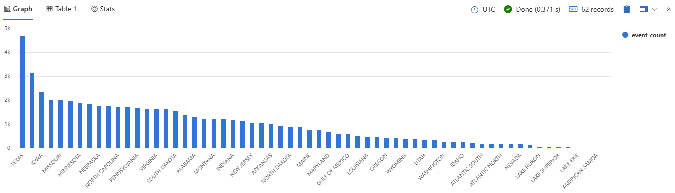
This query provides a visual representation of states with a high frequency of storm events, specifically those with more than 10 events, using a column chart.
StormEvents
| summarize event_count=count() by State
| where event_count > 10
| project State, event_count
| render columnchart
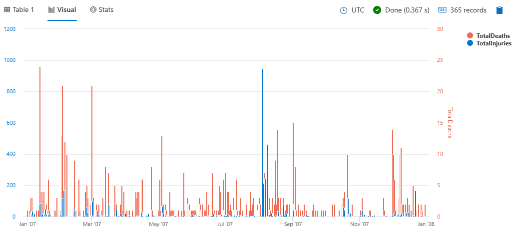
Use the ysplit property
This query provides a daily summary of storm-related injuries and deaths, visualized as a column chart with split axes/panels for better comparison.
StormEvents
| summarize
    TotalInjuries = sum(InjuriesDirect) + sum(InjuriesIndirect),
    TotalDeaths = sum(DeathsDirect) + sum(DeathsIndirect)
    by bin(StartTime, 1d)
| project StartTime, TotalInjuries, TotalDeaths
| render columnchart with (ysplit=axes)
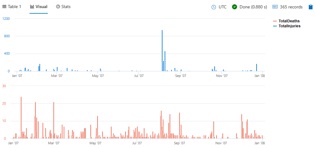
To split the view into separate panels, specify panels instead of axes:
StormEvents
| summarize
    TotalInjuries = sum(InjuriesDirect) + sum(InjuriesIndirect),
    TotalDeaths = sum(DeathsDirect) + sum(DeathsIndirect)
    by bin(StartTime, 1d)
| project StartTime, TotalInjuries, TotalDeaths
| render columnchart with (ysplit=panels)
Example
This query helps you identify states with a significant number of storm events and presents the information in a clear, visual format.
StormEvents
| summarize event_count=count() by State
| where event_count > 10
| project State, event_count
| render columnchart
Feedback
Was this page helpful?
Glad to hear it! Please tell us how we can improve.
Sorry to hear that. Please tell us how we can improve.