Pie chart visualization
The pie chart visual needs a minimum of two columns in the query result. By default, the first column is used as the color axis. This column can contain text, datetime, or numeric data types. Other columns will be used to determine the size of each slice and contain numeric data types. Pie charts are used for presenting a composition of categories and their proportions out of a total.
The pie chart visual can also be used in the context of Geospatial visualizations.
Syntax
T | render piechart [with (propertyName = propertyValue [, …])]
Parameters
| Name | Type | Required | Description |
|---|---|---|---|
| T | string | ✔️ | Input table name. |
| propertyName, propertyValue | string | A comma-separated list of key-value property pairs. See supported properties. |
Supported properties
All properties are optional.
| PropertyName | PropertyValue |
|---|---|
accumulate | Whether the value of each measure gets added to all its predecessors. (true or false) |
kind | Further elaboration of the visualization kind. For more information, see kind property. |
legend | Whether to display a legend or not (visible or hidden). |
series | Comma-delimited list of columns whose combined per-record values define the series that record belongs to. |
title | The title of the visualization (of type string). |
xaxis | How to scale the x-axis (linear or log). |
xcolumn | Which column in the result is used for the x-axis. |
xtitle | The title of the x-axis (of type string). |
yaxis | How to scale the y-axis (linear or log). |
ycolumns | Comma-delimited list of columns that consist of the values provided per value of the x column. |
ytitle | The title of the y-axis (of type string). |
| PropertyName | PropertyValue |
|---|---|
kind | Further elaboration of the visualization kind. For more information, see kind property. |
series | Comma-delimited list of columns whose combined per-record values define the series that record belongs to. |
title | The title of the visualization (of type string). |
kind property
This visualization can be further elaborated by providing the kind property.
The supported values of this property are:
kind value | Description |
|---|---|
map | Expected columns are [Longitude, Latitude] or GeoJSON point, color-axis and numeric. Supported in Kusto Explorer desktop. For more information, see Geospatial visualizations |
Example
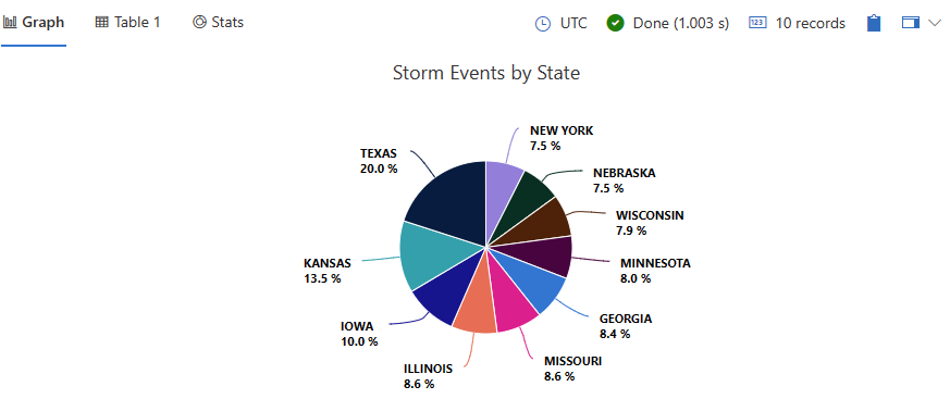
This query provides a visual representation of the top 10 states with the highest number of storm events, displayed as a pie chart
StormEvents
| summarize statecount=count() by State
| sort by statecount
| limit 10
| render piechart with(title="Storm Events by State")

Feedback
Was this page helpful?
Glad to hear it! Please tell us how we can improve.
Sorry to hear that. Please tell us how we can improve.