Scatter chart visualization
In a scatter chart visual, the first column is the x-axis and should be a numeric column. Other numeric columns are y-axes. Scatter plots are used to observe relationships between variables. The scatter chart visual can also be used in the context of Geospatial visualizations.
Syntax
T | render scatterchart [with (propertyName = propertyValue [, …])]
Parameters
| Name | Type | Required | Description |
|---|---|---|---|
| T | string | ✔️ | Input table name. |
| propertyName, propertyValue | string | A comma-separated list of key-value property pairs. See supported properties. |
Supported properties
All properties are optional.
| PropertyName | PropertyValue |
|---|---|
accumulate | Whether the value of each measure gets added to all its predecessors. (true or false) |
kind | Further elaboration of the visualization kind. For more information, see kind property. |
legend | Whether to display a legend or not (visible or hidden). |
series | Comma-delimited list of columns whose combined per-record values define the series that record belongs to. |
ymin | The minimum value to be displayed on Y-axis. |
ymax | The maximum value to be displayed on Y-axis. |
title | The title of the visualization (of type string). |
xaxis | How to scale the x-axis (linear or log). |
xcolumn | Which column in the result is used for the x-axis. |
xtitle | The title of the x-axis (of type string). |
yaxis | How to scale the y-axis (linear or log). |
ycolumns | Comma-delimited list of columns that consist of the values provided per value of the x column. |
ytitle | The title of the y-axis (of type string). |
| PropertyName | PropertyValue |
|---|---|
kind | Further elaboration of the visualization kind. For more information, see kind property. |
series | Comma-delimited list of columns whose combined per-record values define the series that record belongs to. |
title | The title of the visualization (of type string). |
kind property
This visualization can be further elaborated by providing the kind property.
The supported values of this property are:
kind value | Description |
|---|---|
map | Expected columns are [Longitude, Latitude] or GeoJSON point. Series column is optional. For more information, see Geospatial visualizations. |
Example
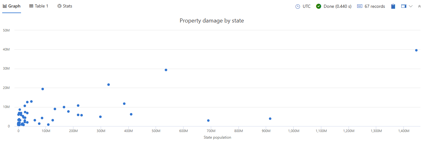
This query provides a scatter chart that helps you analyze the correlation between state populations and the total property damage caused by storm events.
StormEvents
| summarize sum(DamageProperty)by State
| lookup PopulationData on State
| project-away State
| render scatterchart with (xtitle="State population", title="Property damage by state", legend=hidden)

Feedback
Was this page helpful?
Glad to hear it! Please tell us how we can improve.
Sorry to hear that. Please tell us how we can improve.