Time chart visualization
A time chart visual is a type of line graph. The first column of the query is the x-axis, and should be a datetime. Other numeric columns are y-axes. One string column values are used to group the numeric columns and create different lines in the chart. Other string columns are ignored. The time chart visual is like a line chart except the x-axis is always time.
Syntax
T | render timechart [with (propertyName = propertyValue [, …])]
Parameters
| Name | Type | Required | Description |
|---|---|---|---|
| T | string | ✔️ | Input table name. |
| propertyName, propertyValue | string | A comma-separated list of key-value property pairs. See supported properties. |
Supported properties
All properties are optional.
| PropertyName | PropertyValue |
|---|---|
accumulate | Whether the value of each measure gets added to all its predecessors (true or false). |
legend | Whether to display a legend or not (visible or hidden). |
series | Comma-delimited list of columns whose combined per-record values define the series that record belongs to. |
ymin | The minimum value to be displayed on Y-axis. |
ymax | The maximum value to be displayed on Y-axis. |
title | The title of the visualization (of type string). |
xaxis | How to scale the x-axis (linear or log). |
xcolumn | Which column in the result is used for the x-axis. |
xtitle | The title of the x-axis (of type string). |
yaxis | How to scale the y-axis (linear or log). |
ycolumns | Comma-delimited list of columns that consist of the values provided per value of the x column. |
ysplit | How to split the visualization into multiple y-axis values. For more information, see ysplit property. |
ytitle | The title of the y-axis (of type string). |
ysplit property
This visualization supports splitting into multiple y-axis values:
ysplit | Description |
|---|---|
none | A single y-axis is displayed for all series data. (Default) |
axes | A single chart is displayed with multiple y-axes (one per series). |
panels | One chart is rendered for each ycolumn value. Maximum five panels. |
Examples
The example in this section shows how to use the syntax to help you get started.
Render a timechart
The following example renders a timechart with a title “Web app. traffic over a month, decomposing” that decomposes the data into baseline, seasonal, trend, and residual components.
let min_t = datetime(2017-01-05);
let max_t = datetime(2017-02-03 22:00);
let dt = 2h;
demo_make_series2
| make-series num=avg(num) on TimeStamp from min_t to max_t step dt by sid
| where sid == 'TS1'   //  select a single time series for a cleaner visualization
| extend (baseline, seasonal, trend, residual) = series_decompose(num, -1, 'linefit')  //  decomposition of a set of time series to seasonal, trend, residual, and baseline (seasonal+trend)
| render timechart with(title='Web app. traffic over a month, decomposition')

Label a timechart
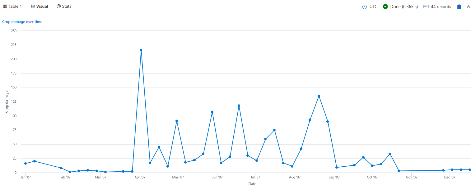
The following example renders a timechart that depicts crop damage grouped by week. The timechart x axis label is “Date” and the y axis label is “Crop damage.”
StormEvents
| where StartTime between (datetime(2007-01-01) .. datetime(2007-12-31))
    and DamageCrops > 0
| summarize EventCount = count() by bin(StartTime, 7d)
| render timechart
    with (
    title="Crop damage over time",
    xtitle="Date",
    ytitle="Crop damage",
    legend=hidden
    )

View multiple y-axes
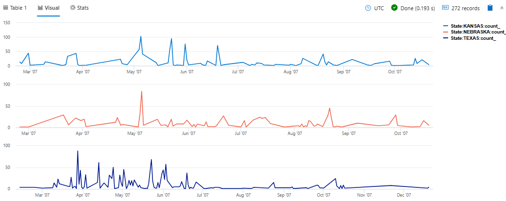
The following example renders daily hail events in the states of Texas, Nebraska, and Kansas. The visualization uses the ysplit property to render each state’s events in separate panels for comparison.
StormEvents
| where State in ("TEXAS", "NEBRASKA", "KANSAS") and EventType == "Hail"
| summarize count() by State, bin(StartTime, 1d)
| render timechart with (ysplit=panels)

Related content
Supported properties
All properties are optional.
| PropertyName | PropertyValue |
|---|---|
series | Comma-delimited list of columns whose combined per-record values define the series that record belongs to. |
title | The title of the visualization (of type string). |
Example
The following example renders a timechart with a title “Web app. traffic over a month, decomposing” that decomposes the data into baseline, seasonal, trend, and residual components.
let min_t = datetime(2017-01-05);
let max_t = datetime(2017-02-03 22:00);
let dt = 2h;
demo_make_series2
| make-series num=avg(num) on TimeStamp from min_t to max_t step dt by sid
| where sid == 'TS1'   //  select a single time series for a cleaner visualization
| extend (baseline, seasonal, trend, residual) = series_decompose(num, -1, 'linefit')  //  decomposition of a set of time series to seasonal, trend, residual, and baseline (seasonal+trend)
| render timechart with(title='Web app. traffic of a month, decomposition')

Feedback
Was this page helpful?
Glad to hear it! Please tell us how we can improve.
Sorry to hear that. Please tell us how we can improve.