This is the multi-page printable view of this section. Click here to print.
Example use cases
1 - Analyze time series data
Cloud services and IoT devices generate telemetry you can use to gain insights into service health, production processes, and usage trends. Time series analysis helps you identify deviations from typical baseline patterns.
Kusto Query Language (KQL) has native support for creating, manipulating, and analyzing multiple time series. This article shows how to use KQL to create and analyze thousands of time series in seconds to enable near real-time monitoring solutions and workflows.
Time series creation
Create a large set of regular time series using the make-series operator and fill in missing values as needed.
Partition and transform the telemetry table into a set of time series. The table usually contains a timestamp column, contextual dimensions, and optional metrics. The dimensions are used to partition the data. The goal is to create thousands of time series per partition at regular time intervals.
The input table demo_make_series1 contains 600K records of arbitrary web service traffic. Use the following command to sample 10 records:
demo_make_series1 | take 10
The resulting table contains a timestamp column, three contextual dimension columns, and no metrics:
| TimeStamp | BrowserVer | OsVer | Country/Region |
|---|---|---|---|
| 2016-08-25 09:12:35.4020000 | Chrome 51.0 | Windows 7 | United Kingdom |
| 2016-08-25 09:12:41.1120000 | Chrome 52.0 | Windows 10 | |
| 2016-08-25 09:12:46.2300000 | Chrome 52.0 | Windows 7 | United Kingdom |
| 2016-08-25 09:12:46.5100000 | Chrome 52.0 | Windows 10 | United Kingdom |
| 2016-08-25 09:12:46.5570000 | Chrome 52.0 | Windows 10 | Republic of Lithuania |
| 2016-08-25 09:12:47.0470000 | Chrome 52.0 | Windows 8.1 | India |
| 2016-08-25 09:12:51.3600000 | Chrome 52.0 | Windows 10 | United Kingdom |
| 2016-08-25 09:12:51.6930000 | Chrome 52.0 | Windows 7 | Netherlands |
| 2016-08-25 09:12:56.4240000 | Chrome 52.0 | Windows 10 | United Kingdom |
| 2016-08-25 09:13:08.7230000 | Chrome 52.0 | Windows 10 | India |
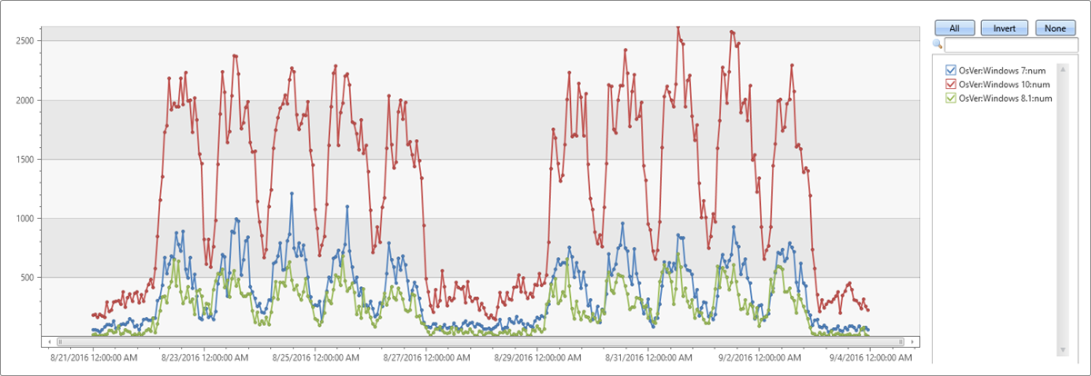
Because there are no metrics, build time series representing the traffic count, partitioned by OS:
let min_t = toscalar(demo_make_series1 | summarize min(TimeStamp));
let max_t = toscalar(demo_make_series1 | summarize max(TimeStamp));
demo_make_series1
| make-series num=count() default=0 on TimeStamp from min_t to max_t step 1h by OsVer
| render timechart
- Use the
make-seriesoperator to create three time series, where:num=count(): traffic count.from min_t to max_t step 1h: creates the time series in one hour bins from the table’s oldest to newest timestamp.default=0: specifies the fill method for missing bins to create regular time series. Alternatively, useseries_fill_const(),series_fill_forward(),series_fill_backward(), andseries_fill_linear()for different fill behavior.by OsVer: partitions by OS.
- The time series data structure is a numeric array of aggregated values for each time bin. Use
render timechartfor visualization.
The table above has three partitions (Windows 10, Windows 7, and Windows 8.1). The chart shows a separate time series for each OS version:
Time series analysis functions
In this section, we’ll perform typical series processing functions. Once a set of time series is created, KQL supports a growing list of functions to process and analyze them. We’ll describe a few representative functions for processing and analyzing time series.
Filtering
Filtering is a common practice in signal processing and useful for time series processing tasks (for example, smooth a noisy signal, change detection).
- There are two generic filtering functions:
series_fir(): Applying FIR filter. Used for simple calculation of moving average and differentiation of the time series for change detection.series_iir(): Applying IIR filter. Used for exponential smoothing and cumulative sum.
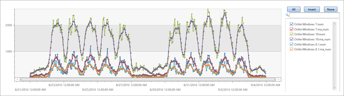
Extendthe time series set by adding a new moving average series of size 5 bins (named ma_num) to the query:
let min_t = toscalar(demo_make_series1 | summarize min(TimeStamp));
let max_t = toscalar(demo_make_series1 | summarize max(TimeStamp));
demo_make_series1
| make-series num=count() default=0 on TimeStamp from min_t to max_t step 1h by OsVer
| extend ma_num=series_fir(num, repeat(1, 5), true, true)
| render timechart
Regression analysis
A segmented linear regression analysis can be used to estimate the trend of the time series.
- Use series_fit_line() to fit the best line to a time series for general trend detection.
- Use series_fit_2lines() to detect trend changes, relative to the baseline, that are useful in monitoring scenarios.
Example of series_fit_line() and series_fit_2lines() functions in a time series query:
demo_series2
| extend series_fit_2lines(y), series_fit_line(y)
| render linechart with(xcolumn=x)
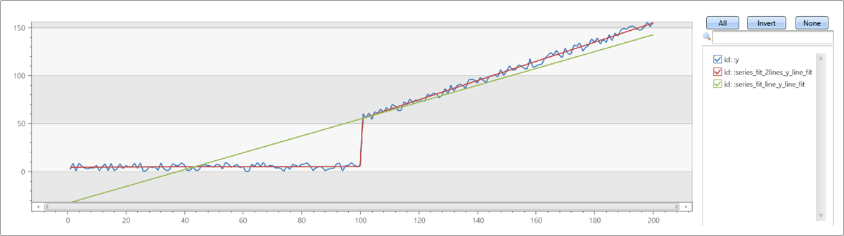
- Blue: original time series
- Green: fitted line
- Red: two fitted lines
Seasonality detection
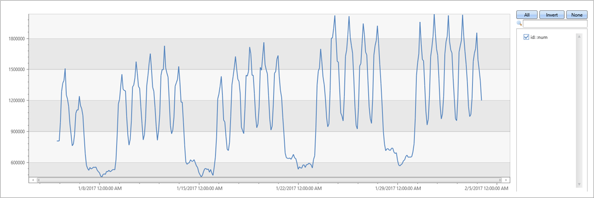
Many metrics follow seasonal (periodic) patterns. User traffic of cloud services usually contains daily and weekly patterns that are highest around the middle of the business day and lowest at night and over the weekend. IoT sensors measure in periodic intervals. Physical measurements such as temperature, pressure, or humidity may also show seasonal behavior.
The following example applies seasonality detection on one month traffic of a web service (2-hour bins):
demo_series3
| render timechart
- Use series_periods_detect() to automatically detect the periods in the time series, where:
num: the time series to analyze0.: the minimum period length in days (0 means no minimum)14d/2h: the maximum period length in days, which is 14 days divided into 2-hour bins2: the number of periods to detect
- Use series_periods_validate() if we know that a metric should have specific distinct periods and we want to verify that they exist.
demo_series3
| project (periods, scores) = series_periods_detect(num, 0., 14d/2h, 2) //to detect the periods in the time series
| mv-expand periods, scores
| extend days=2h*todouble(periods)/1d
| periods | scores | days |
|---|---|---|
| 84 | 0.820622786055595 | 7 |
| 12 | 0.764601405803502 | 1 |
The function detects daily and weekly seasonality. The daily scores less than the weekly because weekend days are different from weekdays.
Element-wise functions
Arithmetic and logical operations can be done on a time series. Using series_subtract() we can calculate a residual time series, that is, the difference between original raw metric and a smoothed one, and look for anomalies in the residual signal:
let min_t = toscalar(demo_make_series1 | summarize min(TimeStamp));
let max_t = toscalar(demo_make_series1 | summarize max(TimeStamp));
demo_make_series1
| make-series num=count() default=0 on TimeStamp from min_t to max_t step 1h by OsVer
| extend ma_num=series_fir(num, repeat(1, 5), true, true)
| extend residual_num=series_subtract(num, ma_num) //to calculate residual time series
| where OsVer == "Windows 10"   // filter on Win 10 to visualize a cleaner chart
| render timechart
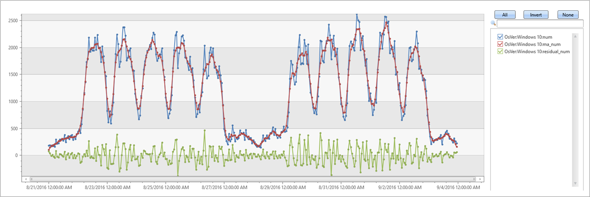
- Blue: original time series
- Red: smoothed time series
- Green: residual time series
Time series workflow at scale
This example shows anomaly detection running at scale on thousands of time series in seconds. To see sample telemetry records for a DB service read count metric over four days, run the following query:
demo_many_series1
| take 4
| TIMESTAMP | Loc | Op | DB | DataRead |
|---|---|---|---|---|
| 2016-09-11 21:00:00.0000000 | Loc 9 | 5117853934049630089 | 262 | 0 |
| 2016-09-11 21:00:00.0000000 | Loc 9 | 5117853934049630089 | 241 | 0 |
| 2016-09-11 21:00:00.0000000 | Loc 9 | -865998331941149874 | 262 | 279862 |
| 2016-09-11 21:00:00.0000000 | Loc 9 | 371921734563783410 | 255 | 0 |
View simple statistics:
demo_many_series1
| summarize num=count(), min_t=min(TIMESTAMP), max_t=max(TIMESTAMP)
| num | min_t | max_t |
|---|---|---|
| 2177472 | 2016-09-08 00:00:00.0000000 | 2016-09-11 23:00:00.0000000 |
A time series in 1-hour bins of the read metric (four days × 24 hours = 96 points) shows normal hourly fluctuation:
let min_t = toscalar(demo_many_series1 | summarize min(TIMESTAMP));
let max_t = toscalar(demo_many_series1 | summarize max(TIMESTAMP));
demo_many_series1
| make-series reads=avg(DataRead) on TIMESTAMP from min_t to max_t step 1h
| render timechart with(ymin=0)
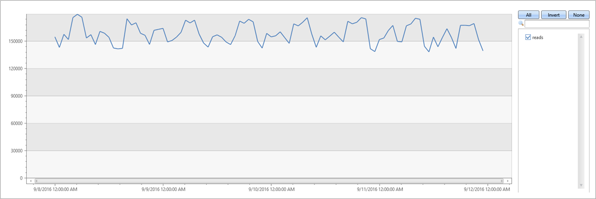
This behavior is misleading because the single normal time series is aggregated from thousands of instances that can have abnormal patterns. Create a time series per instance defined by Loc (location), Op (operation), and DB (specific machine).
How many time series can you create?
demo_many_series1
| summarize by Loc, Op, DB
| count
| Count |
|---|
| 18339 |
Create 18,339 time series for the read count metric. Add the by clause to the make-series statement, apply linear regression, and select the top two time series with the most significant decreasing trend:
let min_t = toscalar(demo_many_series1 | summarize min(TIMESTAMP));
let max_t = toscalar(demo_many_series1 | summarize max(TIMESTAMP));
demo_many_series1
| make-series reads=avg(DataRead) on TIMESTAMP from min_t to max_t step 1h by Loc, Op, DB
| extend (rsquare, slope) = series_fit_line(reads)
| top 2 by slope asc
| render timechart with(title='Service Traffic Outage for 2 instances (out of 18339)')
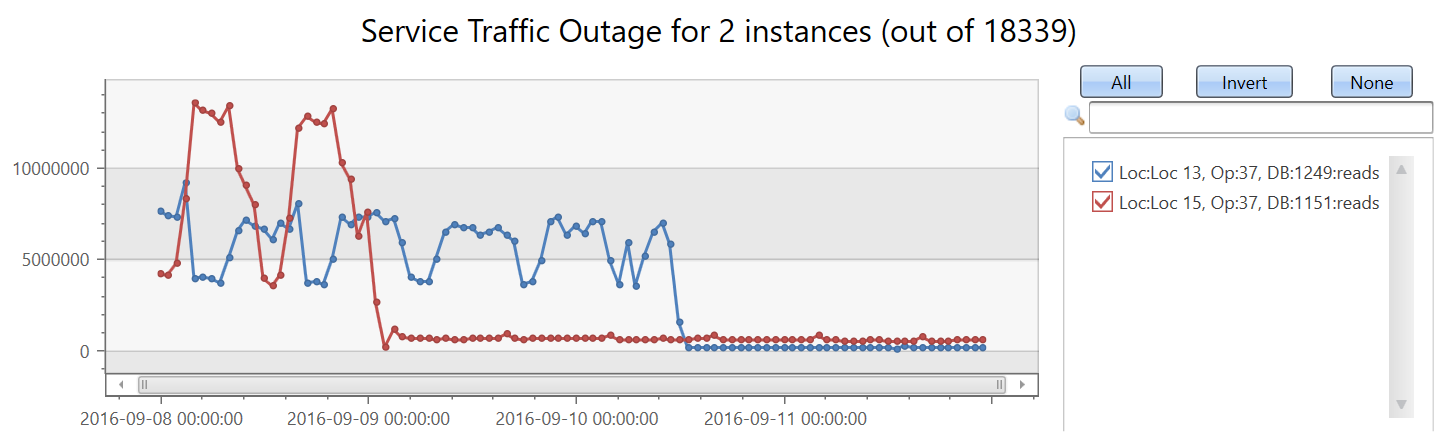
Display the instances:
let min_t = toscalar(demo_many_series1 | summarize min(TIMESTAMP));
let max_t = toscalar(demo_many_series1 | summarize max(TIMESTAMP));
demo_many_series1
| make-series reads=avg(DataRead) on TIMESTAMP from min_t to max_t step 1h by Loc, Op, DB
| extend (rsquare, slope) = series_fit_line(reads)
| top 2 by slope asc
| project Loc, Op, DB, slope
| Loc | Op | DB | slope |
|---|---|---|---|
| Loc 15 | 37 | 1151 | -104,498.46510358342 |
| Loc 13 | 37 | 1249 | -86,614.02919932814 |
In under two minutes, the query analyzes nearly 20,000 time series and detects two with a sudden read count drop.
These capabilities and the platform performance provide a powerful solution for time series analysis.
Related content
- Anomaly detection and forecasting with KQL.
- Machine learning capabilities with KQL.
2 - Anomaly diagnosis for root cause analysis
Kusto Query Language (KQL) has built-in anomaly detection and forecasting functions to check for anomalous behavior. Once such a pattern is detected, a Root Cause Analysis (RCA) can be run to mitigate or resolve the anomaly.
The diagnosis process is complex and lengthy, and done by domain experts. The process includes:
- Fetching and joining more data from different sources for the same time frame
- Looking for changes in the distribution of values on multiple dimensions
- Charting more variables
- Other techniques based on domain knowledge and intuition
Since these diagnosis scenarios are common, machine learning plugins are available to make the diagnosis phase easier, and shorten the duration of the RCA.
All three of the following Machine Learning plugins implement clustering algorithms: autocluster, basket, and diffpatterns. The autocluster and basket plugins cluster a single record set, and the diffpatterns plugin clusters the differences between two record sets.
Clustering a single record set
A common scenario includes a dataset selected by a specific criteria such as:
- Time window that shows anomalous behavior
- High temperature device readings
- Long duration commands
- Top spending users
You want a fast and easy way to find common patterns (segments) in the data. Patterns are a subset of the dataset whose records share the same values over multiple dimensions (categorical columns).
The following query builds and shows a time series of service exceptions over the period of a week, in ten-minute bins:
let min_t = toscalar(demo_clustering1 | summarize min(PreciseTimeStamp));
let max_t = toscalar(demo_clustering1 | summarize max(PreciseTimeStamp));
demo_clustering1
| make-series num=count() on PreciseTimeStamp from min_t to max_t step 10m
| render timechart with(title="Service exceptions over a week, 10 minutes resolution")

The service exception count correlates with the overall service traffic. You can clearly see the daily pattern for business days, Monday to Friday. There’s a rise in service exception counts at mid-day, and drops in counts during the night. Flat low counts are visible over the weekend. Exception spikes can be detected using time series anomaly detection.
The second spike in the data occurs on Tuesday afternoon. The following query is used to further diagnose and verify whether it’s a sharp spike. The query redraws the chart around the spike in a higher resolution of eight hours in one-minute bins. You can then study its borders.
let min_t=datetime(2016-08-23 11:00);
demo_clustering1
| make-series num=count() on PreciseTimeStamp from min_t to min_t+8h step 1m
| render timechart with(title="Zoom on the 2nd spike, 1 minute resolution")

You see a narrow two-minute spike from 15:00 to 15:02. In the following query, count the exceptions in this two-minute window:
let min_peak_t=datetime(2016-08-23 15:00);
let max_peak_t=datetime(2016-08-23 15:02);
demo_clustering1
| where PreciseTimeStamp between(min_peak_t..max_peak_t)
| count
| Count |
|---|
| 972 |
In the following query, sample 20 exceptions out of 972:
let min_peak_t=datetime(2016-08-23 15:00);
let max_peak_t=datetime(2016-08-23 15:02);
demo_clustering1
| where PreciseTimeStamp between(min_peak_t..max_peak_t)
| take 20
| PreciseTimeStamp | Region | ScaleUnit | DeploymentId | Tracepoint | ServiceHost |
|---|---|---|---|---|---|
| 2016-08-23 15:00:08.7302460 | scus | su5 | 9dbd1b161d5b4779a73cf19a7836ebd6 | 100005 | 00000000-0000-0000-0000-000000000000 |
| 2016-08-23 15:00:09.9496584 | scus | su5 | 9dbd1b161d5b4779a73cf19a7836ebd6 | 10007006 | 8d257da1-7a1c-44f5-9acd-f9e02ff507fd |
| 2016-08-23 15:00:10.5911748 | scus | su5 | 9dbd1b161d5b4779a73cf19a7836ebd6 | 100005 | 00000000-0000-0000-0000-000000000000 |
| 2016-08-23 15:00:12.2957912 | scus | su5 | 9dbd1b161d5b4779a73cf19a7836ebd6 | 10007007 | f855fcef-ebfe-405d-aaf8-9c5e2e43d862 |
| 2016-08-23 15:00:18.5955357 | scus | su5 | 9dbd1b161d5b4779a73cf19a7836ebd6 | 10007006 | 9d390e07-417d-42eb-bebd-793965189a28 |
| 2016-08-23 15:00:20.7444854 | scus | su5 | 9dbd1b161d5b4779a73cf19a7836ebd6 | 10007006 | 6e54c1c8-42d3-4e4e-8b79-9bb076ca71f1 |
| 2016-08-23 15:00:23.8694999 | eus2 | su2 | 89e2f62a73bb4efd8f545aeae40d7e51 | 36109 | 19422243-19b9-4d85-9ca6-bc961861d287 |
| 2016-08-23 15:00:26.4271786 | ncus | su1 | e24ef436e02b4823ac5d5b1465a9401e | 36109 | 3271bae4-1c5b-4f73-98ef-cc117e9be914 |
| 2016-08-23 15:00:27.8958124 | scus | su3 | 90d3d2fc7ecc430c9621ece335651a01 | 904498 | 8cf38575-fca9-48ca-bd7c-21196f6d6765 |
| 2016-08-23 15:00:32.9884969 | scus | su3 | 90d3d2fc7ecc430c9621ece335651a01 | 10007007 | d5c7c825-9d46-4ab7-a0c1-8e2ac1d83ddb |
| 2016-08-23 15:00:34.5061623 | scus | su5 | 9dbd1b161d5b4779a73cf19a7836ebd6 | 1002110 | 55a71811-5ec4-497a-a058-140fb0d611ad |
| 2016-08-23 15:00:37.4490273 | scus | su3 | 90d3d2fc7ecc430c9621ece335651a01 | 10007006 | f2ee8254-173c-477d-a1de-4902150ea50d |
| 2016-08-23 15:00:41.2431223 | scus | su3 | 90d3d2fc7ecc430c9621ece335651a01 | 103200 | 8cf38575-fca9-48ca-bd7c-21196f6d6765 |
| 2016-08-23 15:00:47.2983975 | ncus | su1 | e24ef436e02b4823ac5d5b1465a9401e | 423690590 | 00000000-0000-0000-0000-000000000000 |
| 2016-08-23 15:00:50.5932834 | scus | su5 | 9dbd1b161d5b4779a73cf19a7836ebd6 | 10007006 | 2a41b552-aa19-4987-8cdd-410a3af016ac |
| 2016-08-23 15:00:50.8259021 | scus | su5 | 9dbd1b161d5b4779a73cf19a7836ebd6 | 1002110 | 0d56b8e3-470d-4213-91da-97405f8d005e |
| 2016-08-23 15:00:53.2490731 | scus | su5 | 9dbd1b161d5b4779a73cf19a7836ebd6 | 36109 | 55a71811-5ec4-497a-a058-140fb0d611ad |
| 2016-08-23 15:00:57.0000946 | eus2 | su2 | 89e2f62a73bb4efd8f545aeae40d7e51 | 64038 | cb55739e-4afe-46a3-970f-1b49d8ee7564 |
| 2016-08-23 15:00:58.2222707 | scus | su5 | 9dbd1b161d5b4779a73cf19a7836ebd6 | 10007007 | 8215dcf6-2de0-42bd-9c90-181c70486c9c |
| 2016-08-23 15:00:59.9382620 | scus | su3 | 90d3d2fc7ecc430c9621ece335651a01 | 10007006 | 451e3c4c-0808-4566-a64d-84d85cf30978 |
Even though there are less than a thousand exceptions, it’s still hard to find common segments, since there are multiple values in each column. You can use the autocluster() plugin to instantly extract a short list of common segments and find the interesting clusters within the spike’s two minutes, as seen in the following query:
let min_peak_t=datetime(2016-08-23 15:00);
let max_peak_t=datetime(2016-08-23 15:02);
demo_clustering1
| where PreciseTimeStamp between(min_peak_t..max_peak_t)
| evaluate autocluster()
| SegmentId | Count | Percent | Region | ScaleUnit | DeploymentId | ServiceHost |
|---|---|---|---|---|---|---|
| 0 | 639 | 65.7407407407407 | eau | su7 | b5d1d4df547d4a04ac15885617edba57 | e7f60c5d-4944-42b3-922a-92e98a8e7dec |
| 1 | 94 | 9.67078189300411 | scus | su5 | 9dbd1b161d5b4779a73cf19a7836ebd6 | |
| 2 | 82 | 8.43621399176955 | ncus | su1 | e24ef436e02b4823ac5d5b1465a9401e | |
| 3 | 68 | 6.99588477366255 | scus | su3 | 90d3d2fc7ecc430c9621ece335651a01 | |
| 4 | 55 | 5.65843621399177 | weu | su4 | be1d6d7ac9574cbc9a22cb8ee20f16fc |
You can see from the results above that the most dominant segment contains 65.74% of the total exception records and shares four dimensions. The next segment is much less common. It contains only 9.67% of the records, and shares three dimensions. The other segments are even less common.
Autocluster uses a proprietary algorithm for mining multiple dimensions and extracting interesting segments. “Interesting” means that each segment has significant coverage of both the records set and the features set. The segments are also diverged, meaning that each one is different from the others. One or more of these segments might be relevant for the RCA process. To minimize segment review and assessment, autocluster extracts only a small segment list.
You can also use the basket() plugin as seen in the following query:
let min_peak_t=datetime(2016-08-23 15:00);
let max_peak_t=datetime(2016-08-23 15:02);
demo_clustering1
| where PreciseTimeStamp between(min_peak_t..max_peak_t)
| evaluate basket()
| SegmentId | Count | Percent | Region | ScaleUnit | DeploymentId | Tracepoint | ServiceHost |
|---|---|---|---|---|---|---|---|
| 0 | 639 | 65.7407407407407 | eau | su7 | b5d1d4df547d4a04ac15885617edba57 | e7f60c5d-4944-42b3-922a-92e98a8e7dec | |
| 1 | 642 | 66.0493827160494 | eau | su7 | b5d1d4df547d4a04ac15885617edba57 | ||
| 2 | 324 | 33.3333333333333 | eau | su7 | b5d1d4df547d4a04ac15885617edba57 | 0 | e7f60c5d-4944-42b3-922a-92e98a8e7dec |
| 3 | 315 | 32.4074074074074 | eau | su7 | b5d1d4df547d4a04ac15885617edba57 | 16108 | e7f60c5d-4944-42b3-922a-92e98a8e7dec |
| 4 | 328 | 33.7448559670782 | 0 | ||||
| 5 | 94 | 9.67078189300411 | scus | su5 | 9dbd1b161d5b4779a73cf19a7836ebd6 | ||
| 6 | 82 | 8.43621399176955 | ncus | su1 | e24ef436e02b4823ac5d5b1465a9401e | ||
| 7 | 68 | 6.99588477366255 | scus | su3 | 90d3d2fc7ecc430c9621ece335651a01 | ||
| 8 | 167 | 17.1810699588477 | scus | ||||
| 9 | 55 | 5.65843621399177 | weu | su4 | be1d6d7ac9574cbc9a22cb8ee20f16fc | ||
| 10 | 92 | 9.46502057613169 | 10007007 | ||||
| 11 | 90 | 9.25925925925926 | 10007006 | ||||
| 12 | 57 | 5.8641975308642 | 00000000-0000-0000-0000-000000000000 |
Basket implements the “Apriori” algorithm for item set mining. It extracts all segments whose coverage of the record set is above a threshold (default 5%). You can see that more segments were extracted with similar ones, such as segments 0, 1 or 2, 3.
Both plugins are powerful and easy to use. Their limitation is that they cluster a single record set in an unsupervised manner with no labels. It’s unclear whether the extracted patterns characterize the selected record set, anomalous records, or the global record set.
Clustering the difference between two records sets
The diffpatterns() plugin overcomes the limitation of autocluster and basket. Diffpatterns takes two record sets and extracts the main segments that are different. One set usually contains the anomalous record set being investigated. One is analyzed by autocluster and basket. The other set contains the reference record set, the baseline.
In the following query, diffpatterns finds interesting clusters within the spike’s two minutes, which are different from the clusters within the baseline. The baseline window is defined as the eight minutes before 15:00, when the spike started. You extend by a binary column (AB), and specify whether a specific record belongs to the baseline or to the anomalous set. Diffpatterns implements a supervised learning algorithm, where the two class labels were generated by the anomalous versus the baseline flag (AB).
let min_peak_t=datetime(2016-08-23 15:00);
let max_peak_t=datetime(2016-08-23 15:02);
let min_baseline_t=datetime(2016-08-23 14:50);
let max_baseline_t=datetime(2016-08-23 14:58); // Leave a gap between the baseline and the spike to avoid the transition zone.
let splitime=(max_baseline_t+min_peak_t)/2.0;
demo_clustering1
| where (PreciseTimeStamp between(min_baseline_t..max_baseline_t)) or
        (PreciseTimeStamp between(min_peak_t..max_peak_t))
| extend AB=iff(PreciseTimeStamp > splitime, 'Anomaly', 'Baseline')
| evaluate diffpatterns(AB, 'Anomaly', 'Baseline')
| SegmentId | CountA | CountB | PercentA | PercentB | PercentDiffAB | Region | ScaleUnit | DeploymentId | Tracepoint |
|---|---|---|---|---|---|---|---|---|---|
| 0 | 639 | 21 | 65.74 | 1.7 | 64.04 | eau | su7 | b5d1d4df547d4a04ac15885617edba57 | |
| 1 | 167 | 544 | 17.18 | 44.16 | 26.97 | scus | |||
| 2 | 92 | 356 | 9.47 | 28.9 | 19.43 | 10007007 | |||
| 3 | 90 | 336 | 9.26 | 27.27 | 18.01 | 10007006 | |||
| 4 | 82 | 318 | 8.44 | 25.81 | 17.38 | ncus | su1 | e24ef436e02b4823ac5d5b1465a9401e | |
| 5 | 55 | 252 | 5.66 | 20.45 | 14.8 | weu | su4 | be1d6d7ac9574cbc9a22cb8ee20f16fc | |
| 6 | 57 | 204 | 5.86 | 16.56 | 10.69 |
The most dominant segment is the same segment that was extracted by autocluster. Its coverage on the two-minute anomalous window is also 65.74%. However, its coverage on the eight-minute baseline window is only 1.7%. The difference is 64.04%. This difference seems to be related to the anomalous spike. To verify this assumption, the following query splits the original chart into the records that belong to this problematic segment, and records from the other segments.
let min_t = toscalar(demo_clustering1 | summarize min(PreciseTimeStamp));
let max_t = toscalar(demo_clustering1 | summarize max(PreciseTimeStamp));
demo_clustering1
| extend seg = iff(Region == "eau" and ScaleUnit == "su7" and DeploymentId == "b5d1d4df547d4a04ac15885617edba57"
and ServiceHost == "e7f60c5d-4944-42b3-922a-92e98a8e7dec", "Problem", "Normal")
| make-series num=count() on PreciseTimeStamp from min_t to max_t step 10m by seg
| render timechart

This chart allows us to see that the spike on Tuesday afternoon was because of exceptions from this specific segment, discovered by using the diffpatterns plugin.
Summary
The Machine Learning plugins are helpful for many scenarios. The autocluster and basket implement an unsupervised learning algorithm and are easy to use. Diffpatterns implements a supervised learning algorithm and, although more complex, it’s more powerful for extracting differentiation segments for RCA.
These plugins are used interactively in ad-hoc scenarios and in automatic near real-time monitoring services. Time series anomaly detection is followed by a diagnosis process. The process is highly optimized to meet necessary performance standards.
3 - Time series anomaly detection & forecasting
Cloud services and IoT devices generate telemetry you use to monitor service health, production processes, and usage trends. Time series analysis helps you spot deviations from each metric’s baseline pattern.
Kusto Query Language (KQL) includes native support for creating, manipulating, and analyzing multiple time series. Use KQL to create and analyze thousands of time series in seconds for near real time monitoring.
This article describes KQL time series anomaly detection and forecasting capabilities. The functions use a robust, well known decomposition model that splits each time series into seasonal, trend, and residual components. Detect anomalies by finding outliers in the residual component. Forecast by extrapolating the seasonal and trend components. KQL adds automatic seasonality detection, robust outlier analysis, and a vectorized implementation that processes thousands of time series in seconds.
Prerequisites
- Use a Microsoft account or a Microsoft Entra user identity. You don’t need an Azure subscription.
- Read about time series capabilities in Time series analysis.
Time series decomposition model
The KQL native implementation for time series prediction and anomaly detection uses a well known decomposition model. Use this model for time series with periodic and trend behavior—like service traffic, component heartbeats, and periodic IoT measurements—to forecast future values and detect anomalies. The regression assumes the remainder is random after removing the seasonal and trend components. Forecast future values from the seasonal and trend components (the baseline) and ignore the residual. Detect anomalies by running outlier analysis on the residual component.
Use the series_decompose() function to create a decomposition model. It decomposes each time series into seasonal, trend, residual, and baseline components.
Example: Decompose internal web service traffic:
let min_t = datetime(2017-01-05);
let max_t = datetime(2017-02-03 22:00);
let dt = 2h;
demo_make_series2
| make-series num=avg(num) on TimeStamp from min_t to max_t step dt by sid
| where sid == 'TS1'   // Select a single time series for cleaner visualization
| extend (baseline, seasonal, trend, residual) = series_decompose(num, -1, 'linefit')  // Decompose each time series into seasonal, trend, residual, and baseline (seasonal + trend)
| render timechart with(title='Web app traffic for one month, decomposition', ysplit=panels)

- The original time series is labeled num (in red).
- The process autodetects seasonality using the
series_periods_detect()function and extracts the seasonal pattern (purple). - Subtract the seasonal pattern from the original time series, then run a linear regression with the
series_fit_line()function to find the trend component (light blue). - The function subtracts the trend, and the remainder is the residual component (green).
- Finally, add the seasonal and trend components to generate the baseline (blue).
Time series anomaly detection
The function series_decompose_anomalies() finds anomalous points on a set of time series. This function calls series_decompose() to build the decomposition model and then runs series_outliers() on the residual component. series_outliers() calculates anomaly scores for each point of the residual component using Tukey’s fence test. Anomaly scores above 1.5 or below -1.5 indicate a mild anomaly rise or decline respectively. Anomaly scores above 3.0 or below -3.0 indicate a strong anomaly.
The following query allows you to detect anomalies in internal web service traffic:
let min_t = datetime(2017-01-05);
let max_t = datetime(2017-02-03 22:00);
let dt = 2h;
demo_make_series2
| make-series num=avg(num) on TimeStamp from min_t to max_t step dt by sid
| where sid == 'TS1'   //  select a single time series for a cleaner visualization
| extend (anomalies, score, baseline) = series_decompose_anomalies(num, 1.5, -1, 'linefit')
| render anomalychart with(anomalycolumns=anomalies, title='Web app. traffic of a month, anomalies') //use "| render anomalychart with anomalycolumns=anomalies" to render the anomalies as bold points on the series charts.

- The original time series (in red).
- The baseline (seasonal + trend) component (in blue).
- The anomalous points (in purple) on top of the original time series. The anomalous points significantly deviate from the expected baseline values.
Time series forecasting
The function series_decompose_forecast() predicts future values of a set of time series. This function calls series_decompose() to build the decomposition model and then, for each time series, extrapolates the baseline component into the future.
The following query allows you to predict next week’s web service traffic:
let min_t = datetime(2017-01-05);
let max_t = datetime(2017-02-03 22:00);
let dt = 2h;
let horizon=7d;
demo_make_series2
| make-series num=avg(num) on TimeStamp from min_t to max_t+horizon step dt by sid
| where sid == 'TS1'   //  select a single time series for a cleaner visualization
| extend forecast = series_decompose_forecast(num, toint(horizon/dt))
| render timechart with(title='Web app. traffic of a month, forecasting the next week by Time Series Decomposition')

- Original metric (in red). Future values are missing and set to 0, by default.
- Extrapolate the baseline component (in blue) to predict next week’s values.
Scalability
Kusto Query Language syntax enables a single call to process multiple time series. Its unique optimized implementation allows for fast performance, which is critical for effective anomaly detection and forecasting when monitoring thousands of counters in near real-time scenarios.
The following query shows the processing of three time series simultaneously:
let min_t = datetime(2017-01-05);
let max_t = datetime(2017-02-03 22:00);
let dt = 2h;
let horizon=7d;
demo_make_series2
| make-series num=avg(num) on TimeStamp from min_t to max_t+horizon step dt by sid
| extend offset=case(sid=='TS3', 4000000, sid=='TS2', 2000000, 0)   //  add artificial offset for easy visualization of multiple time series
| extend num=series_add(num, offset)
| extend forecast = series_decompose_forecast(num, toint(horizon/dt))
| render timechart with(title='Web app. traffic of a month, forecasting the next week for 3 time series')

Summary
This document details native KQL functions for time series anomaly detection and forecasting. Each original time series is decomposed into seasonal, trend, and residual components for detecting anomalies and/or forecasting. These functionalities can be used for near real-time monitoring scenarios, such as fault detection, predictive maintenance, and demand and load forecasting.
Related content
- Learn about Anomaly diagnosis capabilities with KQL